Producing a Pie Chart
Usage
plotPieChart(
  data = NULL,
  metaData = NULL,
  dataMapping = NULL,
  colorPalette = NULL,
  start = NULL,
  clockwiseDirection = NULL,
  plotConfiguration = NULL,
  plotObject = NULL
)
Arguments
- data
A data.frame to use for plot.
- metaData
A named list of information about
datasuch as thedimensionandunitof its variables.- dataMapping
A
PieChartDataMappingobject mappingxandfillaesthetic groups to their variable names ofdata. Values mapped toyvariable will be displayed as text within the pie chart- colorPalette
color palette property from
ggplot2- start
Offset of starting point from 12 o'clock in radians. Offset is applied clockwise or anticlockwise depending on value of direction
- clockwiseDirection
logical defining if values are displayed in clockwise order
- plotConfiguration
An optional
PieChartPlotConfigurationobject defining labels, grid, background and watermark.- plotObject
An optional
ggplotobject on which to add the plot layer
Examples
# Data for the pie chart
values <- runif(5)
data <- data.frame(
values = values,
text = paste0(round(100 * values / sum(values)), "%"),
legend = letters[1:5]
)
# Plot pie chart with its legend
plotPieChart(
data = data,
dataMapping = PieChartDataMapping$new(x = "values", fill = "legend")
)
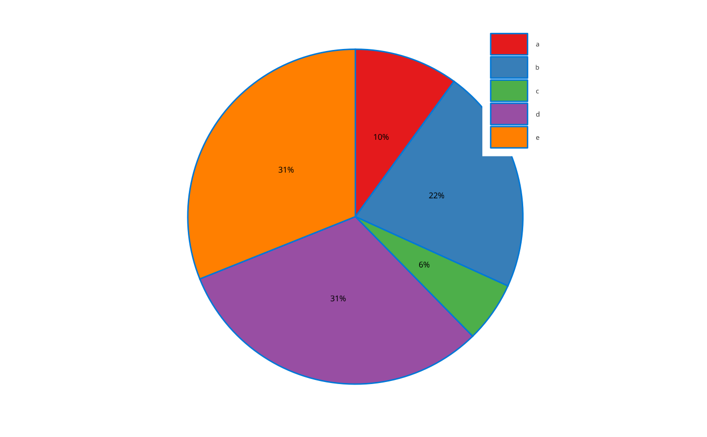
 # Plot pie chart with text within pie
plotPieChart(
data = data,
dataMapping = PieChartDataMapping$new(x = "values", y = "text", fill = "legend")
)
# Plot pie chart with text within pie
plotPieChart(
data = data,
dataMapping = PieChartDataMapping$new(x = "values", y = "text", fill = "legend")
)
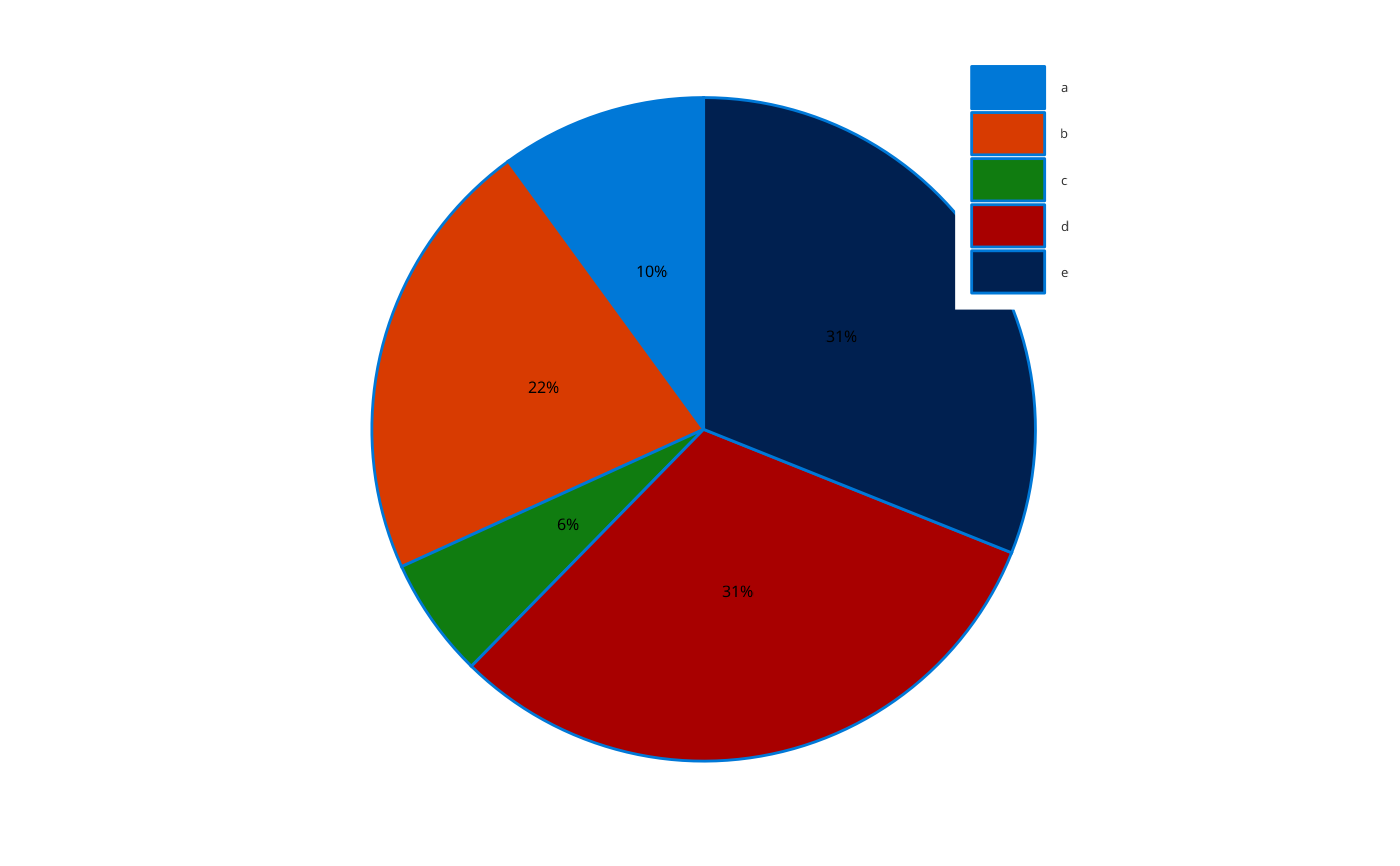
 # Reverse direction of pie chart
plotPieChart(
data = data,
dataMapping = PieChartDataMapping$new(x = "values", y = "text", fill = "legend"),
clockwiseDirection = FALSE
)
# Reverse direction of pie chart
plotPieChart(
data = data,
dataMapping = PieChartDataMapping$new(x = "values", y = "text", fill = "legend"),
clockwiseDirection = FALSE
)
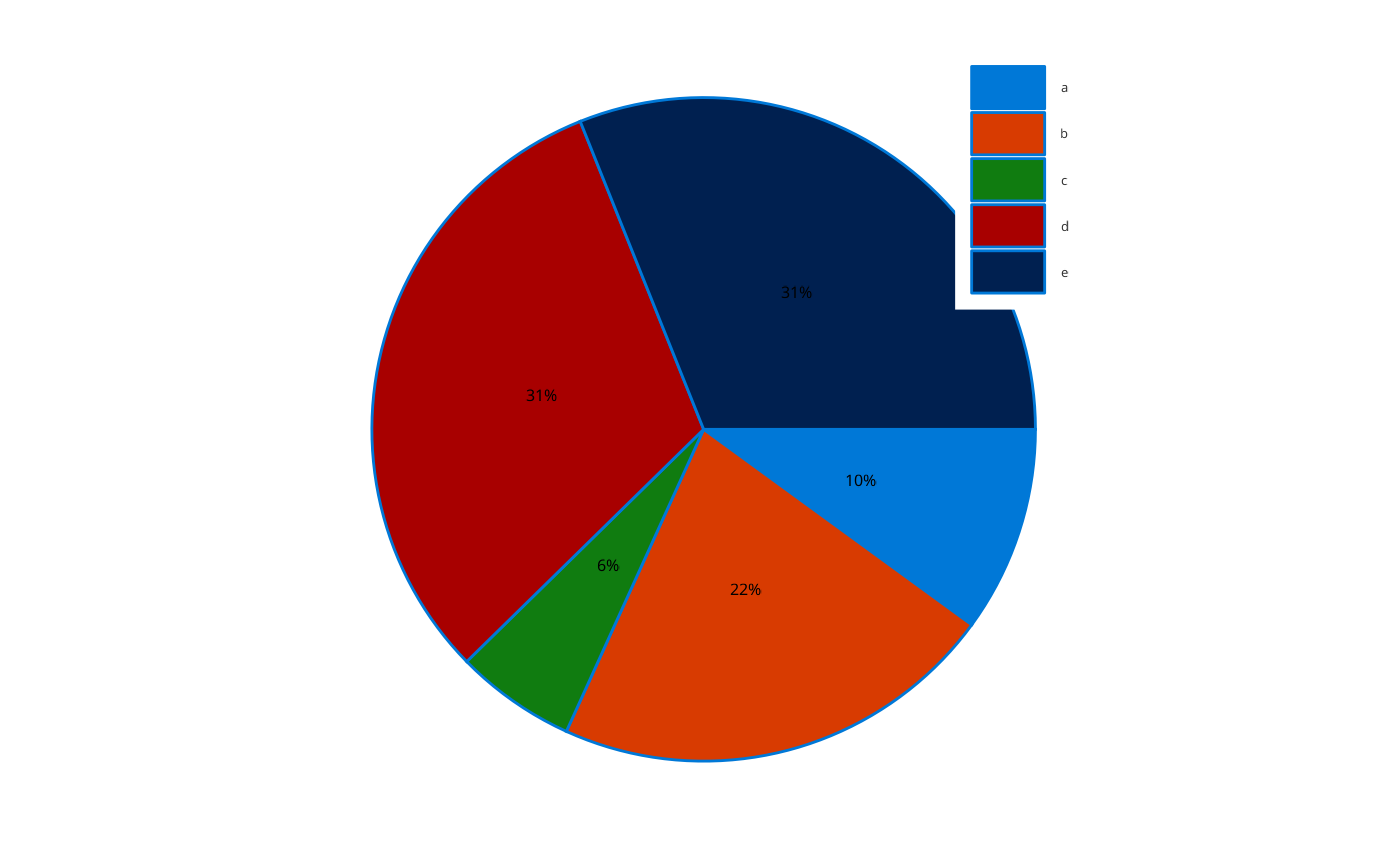
 # Start first slice of pie at 90 degrees
plotPieChart(
data = data,
dataMapping = PieChartDataMapping$new(x = "values", y = "text", fill = "legend"),
start = pi / 2
)
# Start first slice of pie at 90 degrees
plotPieChart(
data = data,
dataMapping = PieChartDataMapping$new(x = "values", y = "text", fill = "legend"),
start = pi / 2
)
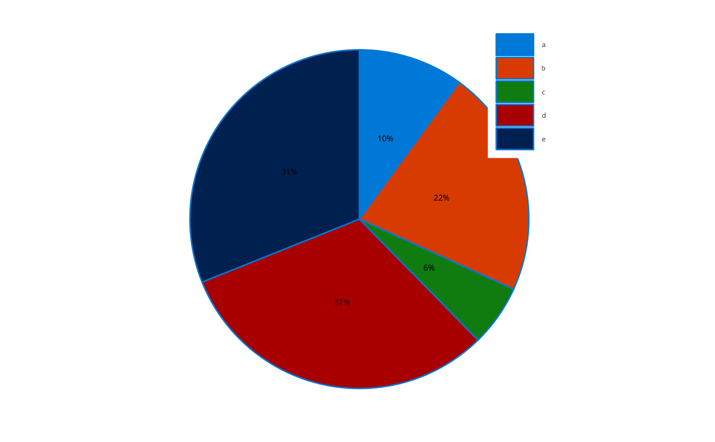
 # Leverages ggplot color palettes
plotPieChart(
data = data,
dataMapping = PieChartDataMapping$new(x = "values", y = "text", fill = "legend"),
colorPalette = ColorPalettes$Set1
)
# Leverages ggplot color palettes
plotPieChart(
data = data,
dataMapping = PieChartDataMapping$new(x = "values", y = "text", fill = "legend"),
colorPalette = ColorPalettes$Set1
)