This vignette tackles how to use atom plots to prepare simple to more
complex plots with the tlf-library.
Introduction to atom plots
An atom plot corresponds to a simple plot that can be combined with other atom plots to form a final molecule plot, often more complex.
initializePlot
The tlf function
initializePlot creates an empty plot whose
properties are defined by a PlotConfiguration object. The
function initializePlot is called by every tlf
plot function if no plotObject is provided as input and
returns a regular ggplot object that includes an additional
field named plotConfiguration defining its properties as a
PlotConfiguration object.
A detailed presentation of PlotConfiguration objects is available in the vignette plot-configuration.
A few examples that use initializePlot are shown
below.
- Initialize an empty plot from the current theme (no
plotConfigurationinput)

- Initialize an empty plot with labels defined by
plotConfigurationinput
# Create a PlotConfiguration object to specify plot properties (here labels)
myConfiguration <- PlotConfiguration$new(
  title = "My empty plot",
  xlabel = "My X axis",
  ylabel = "My Y axis"
)
# Use the obect to define the plot properties
initializePlot(plotConfiguration = myConfiguration)
- Initialize an empty plot whose
plotConfigurationinput usesdata,metaDataanddataMappingto fill the plot x and y labels.- if
metaDataprovides dimension and unit, the labels will bedimension [unit]by default. - if only
datais provided, the labels will include the column name by default - if
xlabelandylabelare used, they will replace those default
- if
| time | cos | sin |
|---|---|---|
| 0.0 | 1.0000000 | 0.0000000 |
| 0.5 | 0.8775826 | 0.4794255 |
| 1.0 | 0.5403023 | 0.8414710 |
| 1.5 | 0.0707372 | 0.9974950 |
| 2.0 | -0.4161468 | 0.9092974 |
| 2.5 | -0.8011436 | 0.5984721 |
# Define which is x and y variables using dataMapping
cosMapping <- XYGDataMapping$new(x = "time", y = "cos")

# Define the metaData
cosMetaData <- list(
  time = list(
    dimension = "Time",
    unit = "min"
  ),
  cos = list(
    dimension = "Cosinus",
    unit = ""
  )
)
cosMetaData
#> $time
#> $time$dimension
#> [1] "Time"
#>
#> $time$unit
#> [1] "min"
#>
#>
#> $cos
#> $cos$dimension
#> [1] "Cosinus"
#>
#> $cos$unit
#> [1] ""
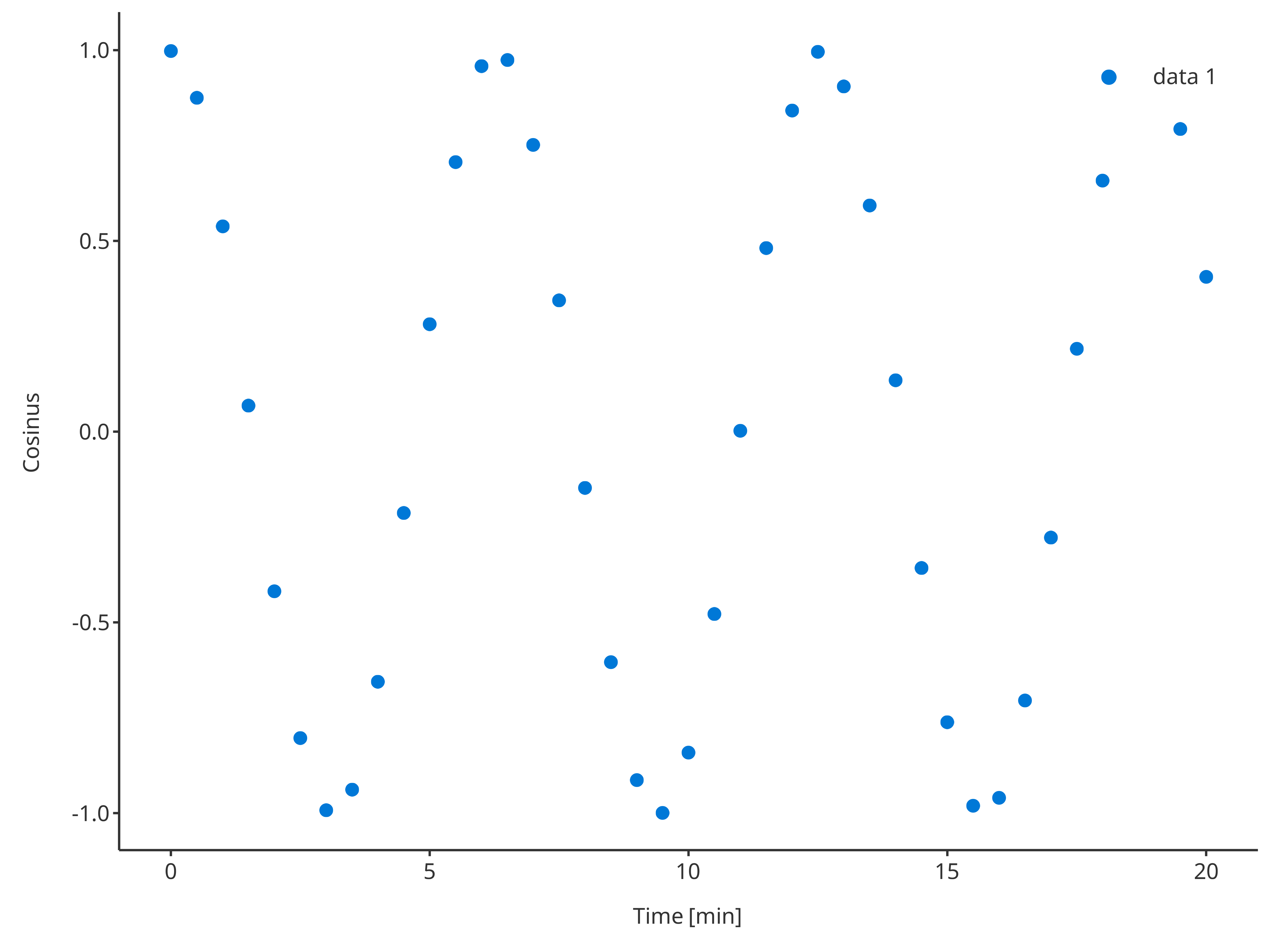
# Define default Configuration with metaData
metaDataConfiguration <- PlotConfiguration$new(
  title = "Cosinus plot",
  data = cosData,
  metaData = cosMetaData,
  dataMapping = cosMapping
)

initializePlot(plotConfiguration = metaDataConfiguration)
# Define default Configuration with metaData
dataConfiguration <- PlotConfiguration$new(
  title = "Cosinus plot",
  data = cosData,
  dataMapping = cosMapping
)

initializePlot(plotConfiguration = dataConfiguration)
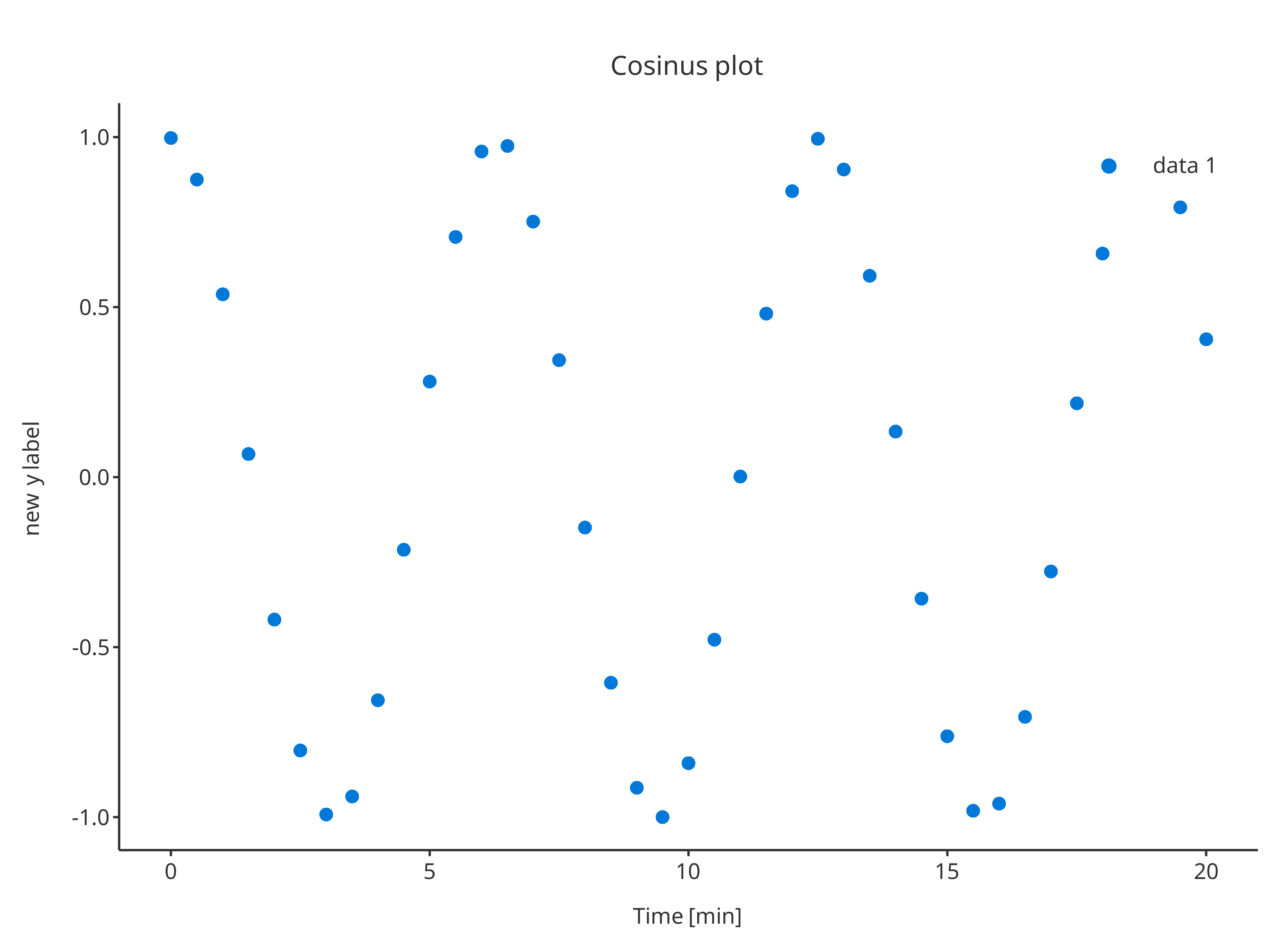
# Define default Configuration with metaData
overwriteConfiguration <- PlotConfiguration$new(
  title = "Cosinus plot",
  ylabel = "new y label",
  data = cosData,
  metaData = cosMetaData,
  dataMapping = cosMapping
)

initializePlot(plotConfiguration = overwriteConfiguration)
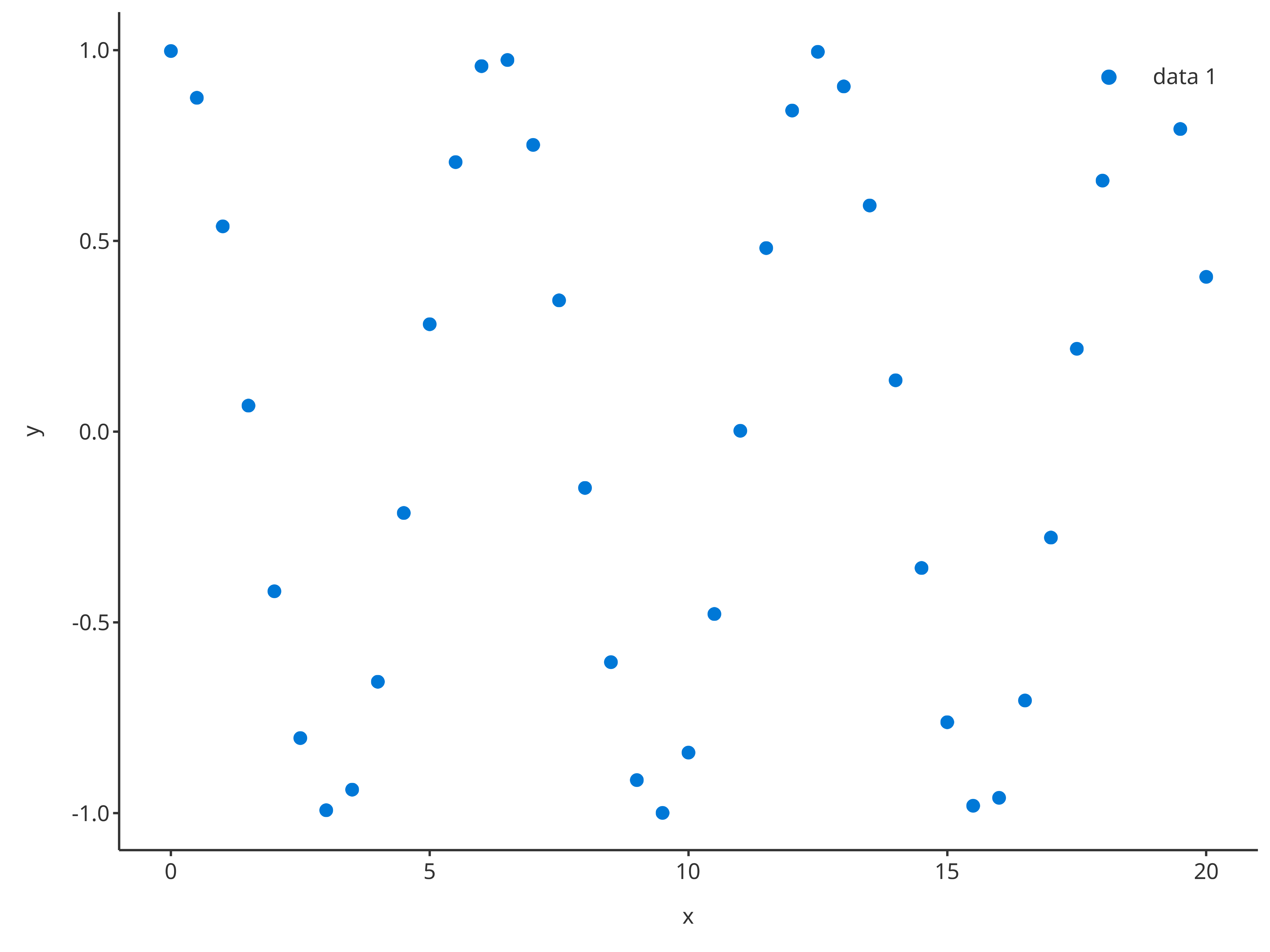
addScatter
The function addScatter returns a scatter plot. Likewise all
the tlf plot functions, the input argument
data and its metaData can be used to defined
what to plot.
addScatter(
  data = cosData,
  metaData = cosMetaData,
  dataMapping = cosMapping
)
The argument plotConfiguration also works the same way
as in initializePlot:
addScatter(
  data = cosData,
  metaData = cosMetaData,
  dataMapping = cosMapping,
  plotConfiguration = overwriteConfiguration
)
The function addScatter also supports x and
y inputs instead of data and its
dataMapping. In this case, the function will internally
create the data.frame with x and y column
names along with its data mapping.
addScatter(
  x = cosData$time,
  y = cosData$cos
)
It is also possible to prove a plotConfiguration to
define the properties especially the labels of the plot created by this
process.
addScatter(
  x = cosData$time,
  y = cosData$cos,
  plotConfiguration = overwriteConfiguration
)
Additionally, optional arguments can be used that will overwrite the
default and specific properties of the
plotConfiguration.
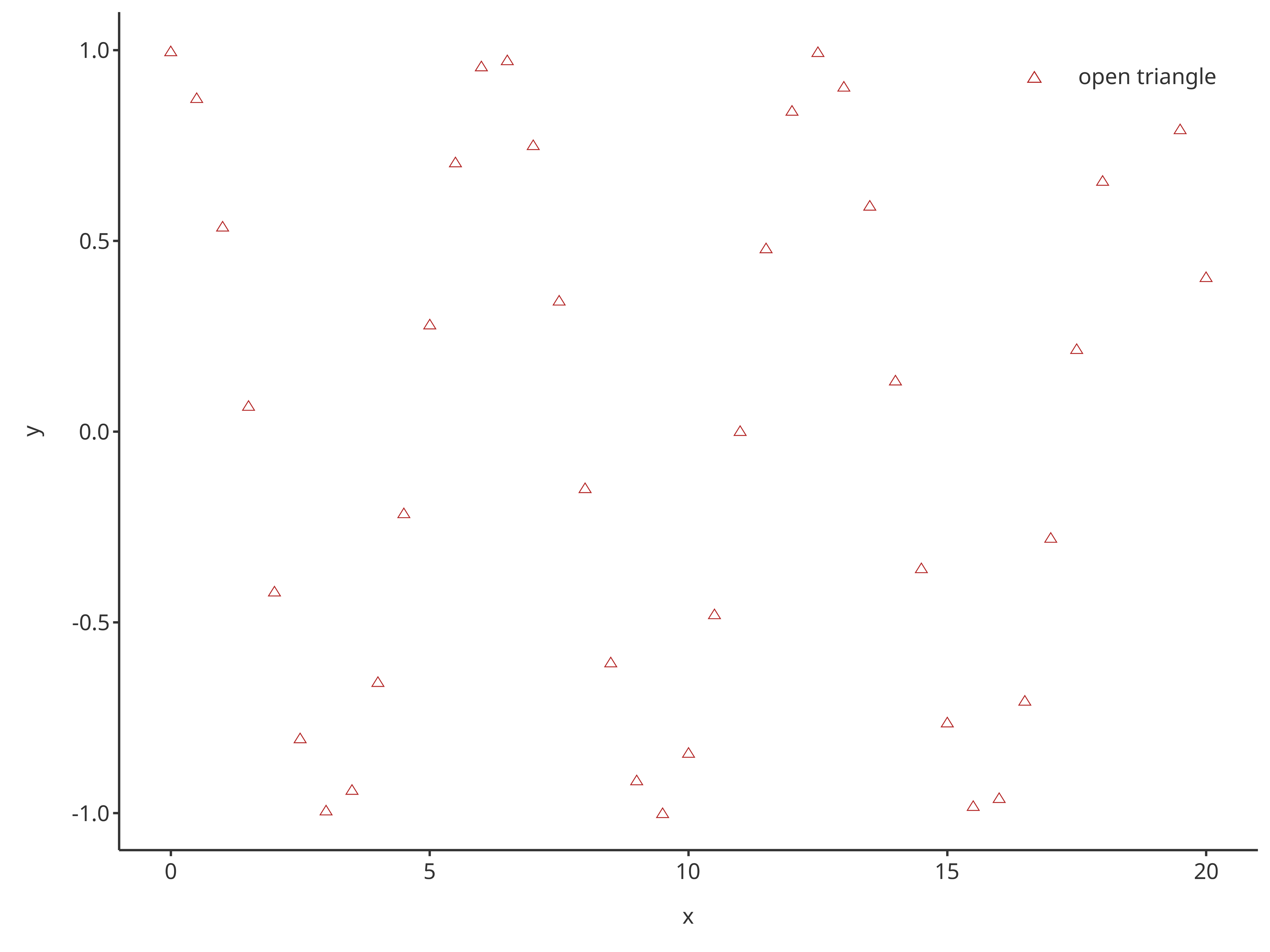
-
color: color of the scatter points. Note that multiple colors can be provided ifdataMappingdefines multiple groups. -
shape: shape of the scatter points. Note that multiple shapes can be provided ifdataMappingdefines multiple groups. -
size: size of the scatter points. Note that multiple shapes can be provided ifdataMappingdefines multiple groups. -
linetype: linetype of lines connecting the scatter points. Note that multiple linetypes can be provided ifdataMappingdefines multiple groups. -
caption: Name of the legend caption for the scatter points. Note that multiple captions can be provided ifdataMappingdefines multiple groups.
addScatter(
  x = cosData$time,
  y = cosData$cos,
  color = "firebrick",
  shape = Shapes$triangleOpen,
  size = 3,
  caption = "open triangle"
)
If the input argument plotObject is used, then the
scatter layer is added on top of the input plot and will use the
plotConfiguration of plotObject.
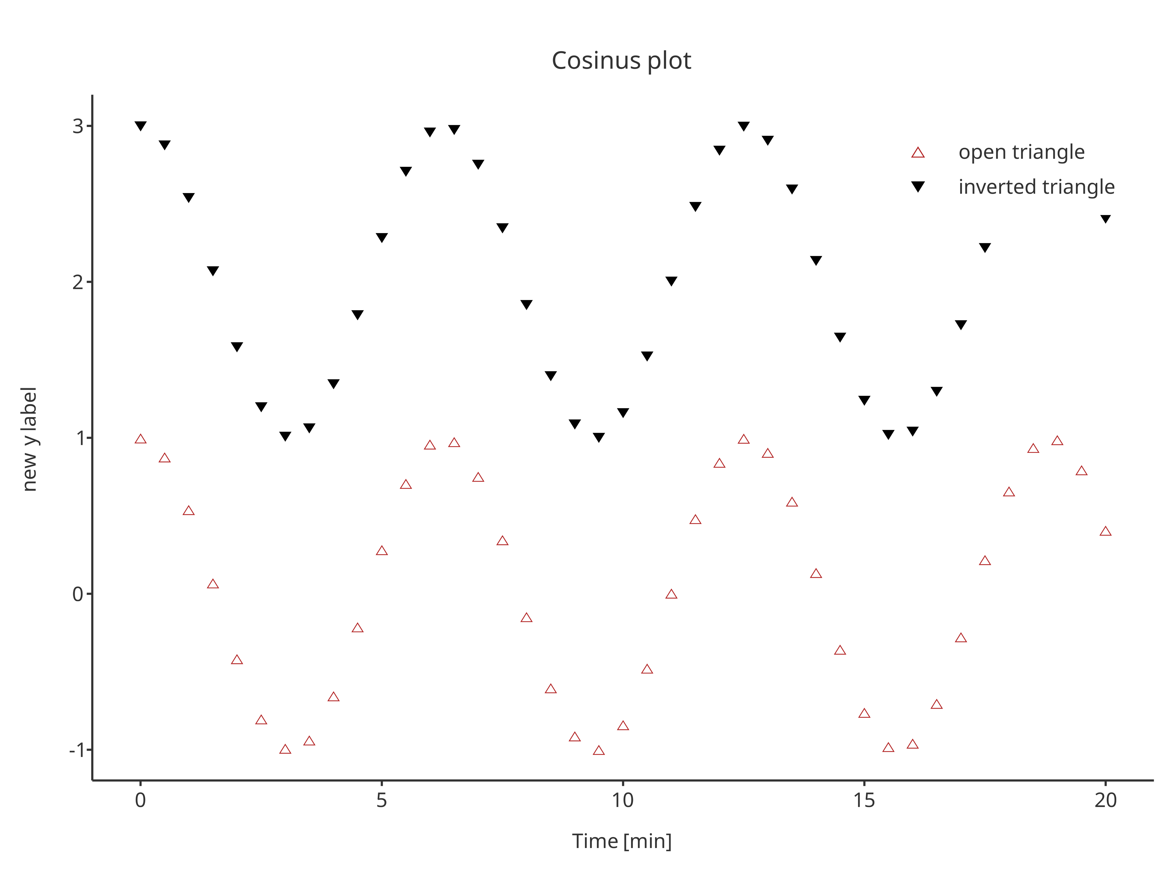
scatterPlot <- addScatter(
  x = cosData$time,
  y = cosData$cos,
  color = "firebrick",
  shape = Shapes$triangleOpen,
  size = 3,
  caption = "open triangle",
  plotConfiguration = overwriteConfiguration
)

scatterPlot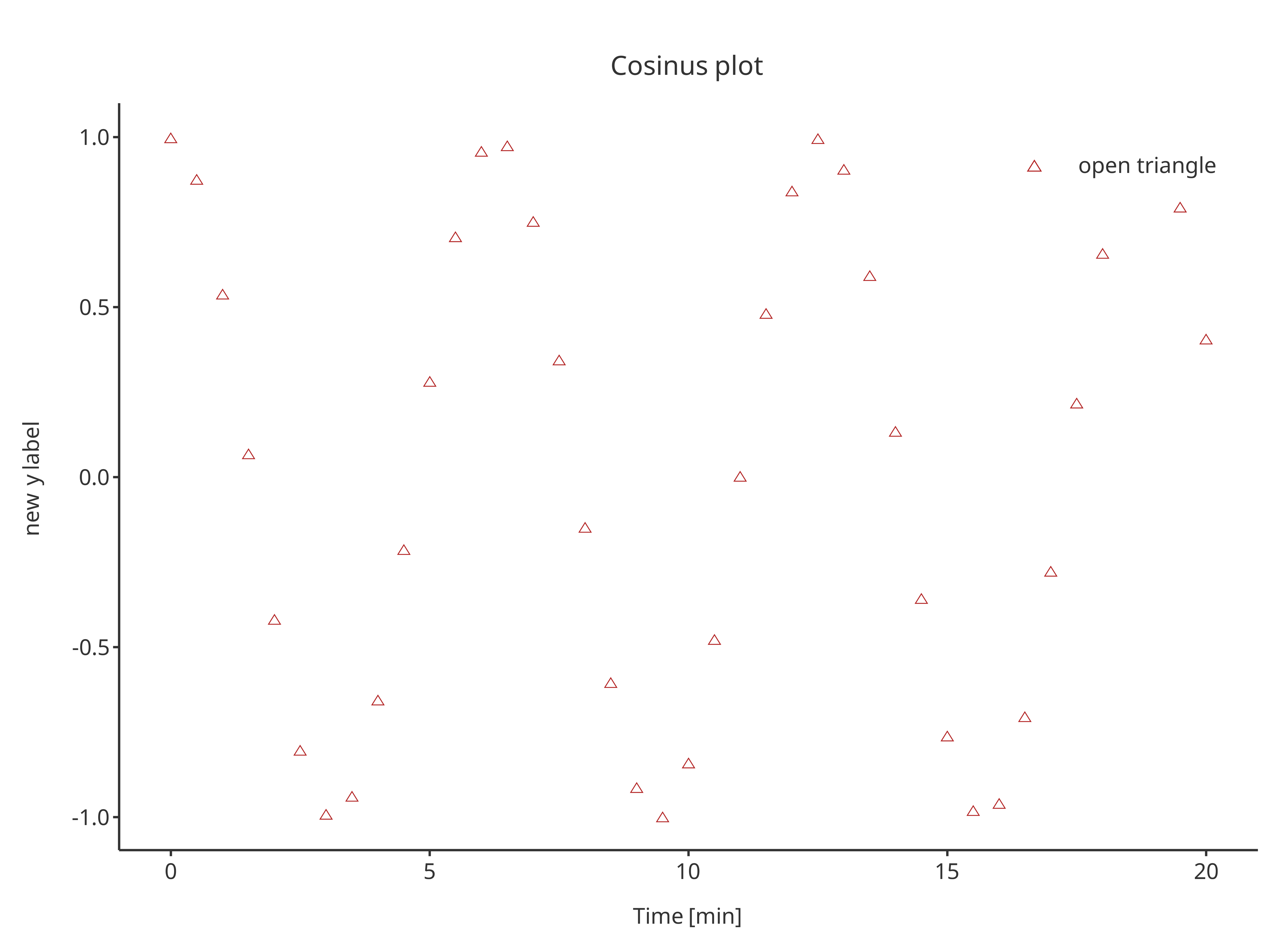
addScatter(
  x = cosData$time,
  y = cosData$cos + 2,
  color = "black",
  shape = Shapes$invertedTriangle,
  size = 3,
  caption = "inverted triangle",
  plotObject = scatterPlot
)
addLine
The function addLine returns a line plot. The same
arguments as addScatter can be used by
addLine, only default properties are different.
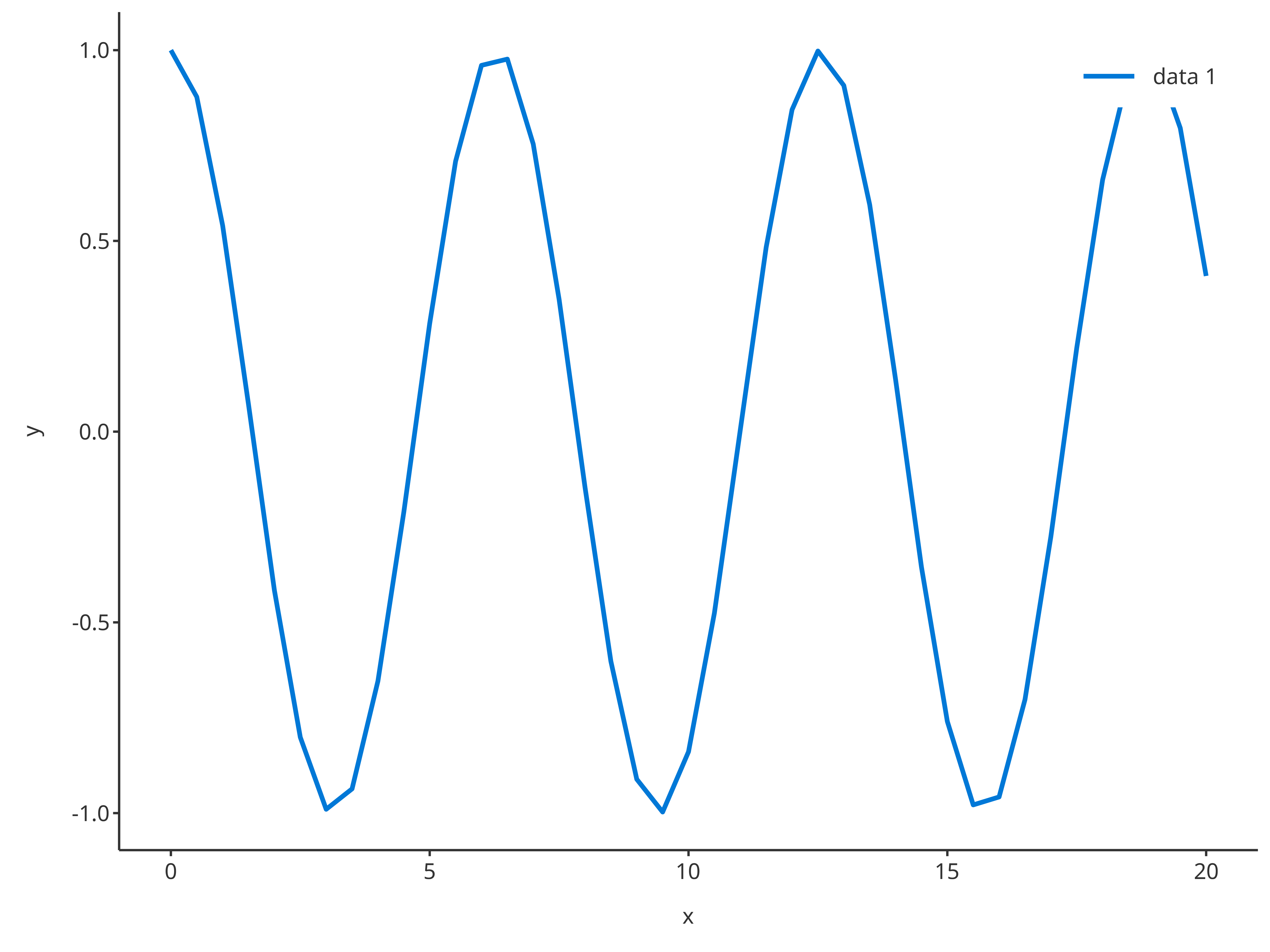
addLine(
  x = cosData$time,
  y = cosData$cos
)
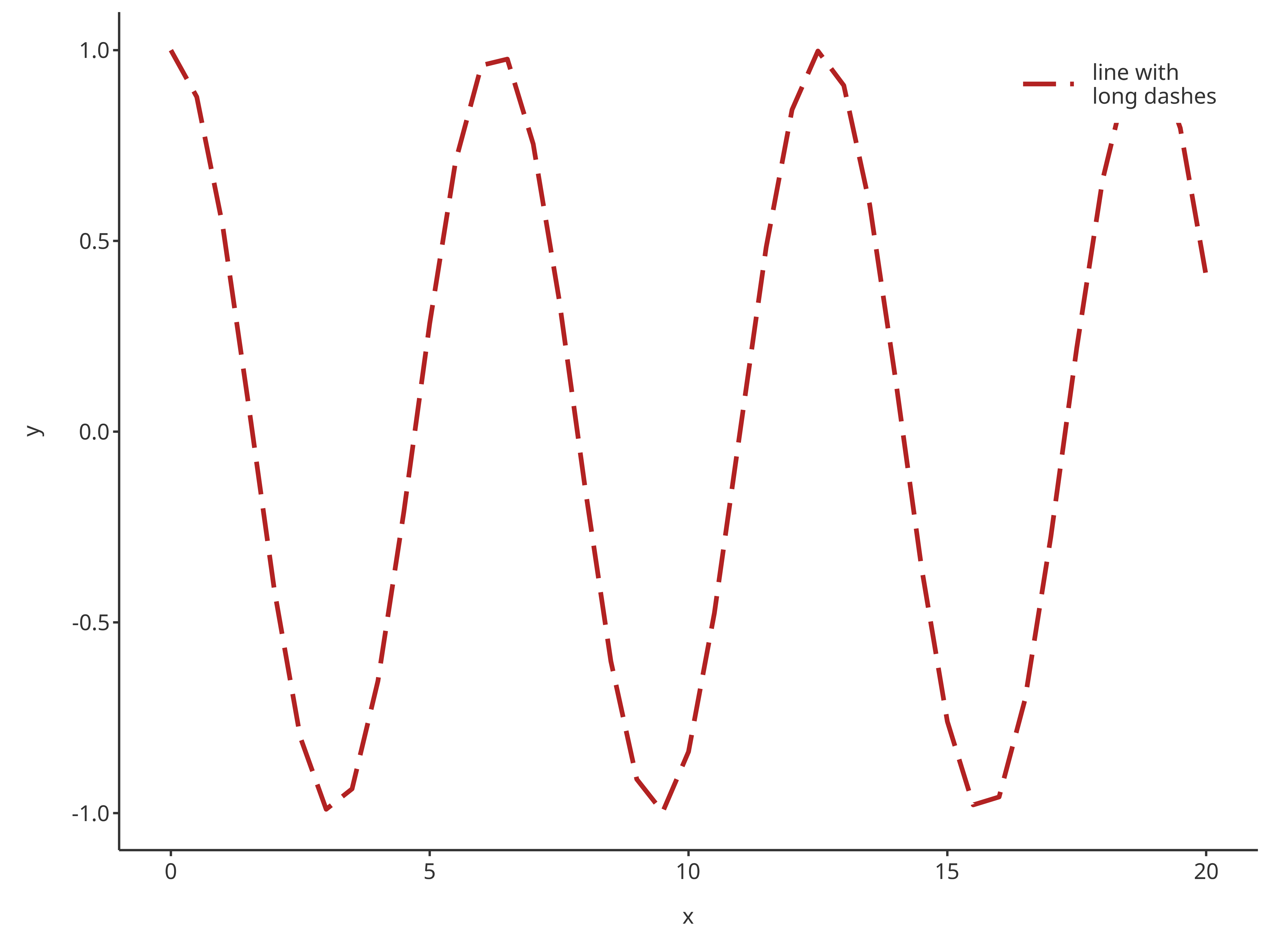
addLine(
  x = cosData$time,
  y = cosData$cos,
  color = "firebrick",
  linetype = Linetypes$longdash,
  size = 1,
  caption = "line with\nlong dashes"
)
Since line plots can include horizontal and vertical lines,
addLine has the possibility of using x or
y input for x/y-intercepts.
The functions addScatter and addLine can
also be combined:
scatterPlot <- addScatter(
  x = cosData$time,
  y = cosData$cos,
  color = "firebrick",
  shape = Shapes$diamond,
  size = 3,
  caption = "diamond",
  plotConfiguration = overwriteConfiguration
)

scatterPlot

addLine(
  y = 0.5,
  color = "dodgerblue",
  linetype = Linetypes$solid,
  size = 0.5,
  caption = "threshold",
  plotObject = scatterPlot
)Caution: It is possible to define the transparency
of the points and lines using PlotConfiguration objects
using the field alpha in lines or
points. Lines with transparency in legend may disappear
when the plot is displayed within the viewport for older versions of
RStudio (for more details, see https://github.com/tidyverse/ggplot2/issues/4351).
However, this does not affect exported plots.
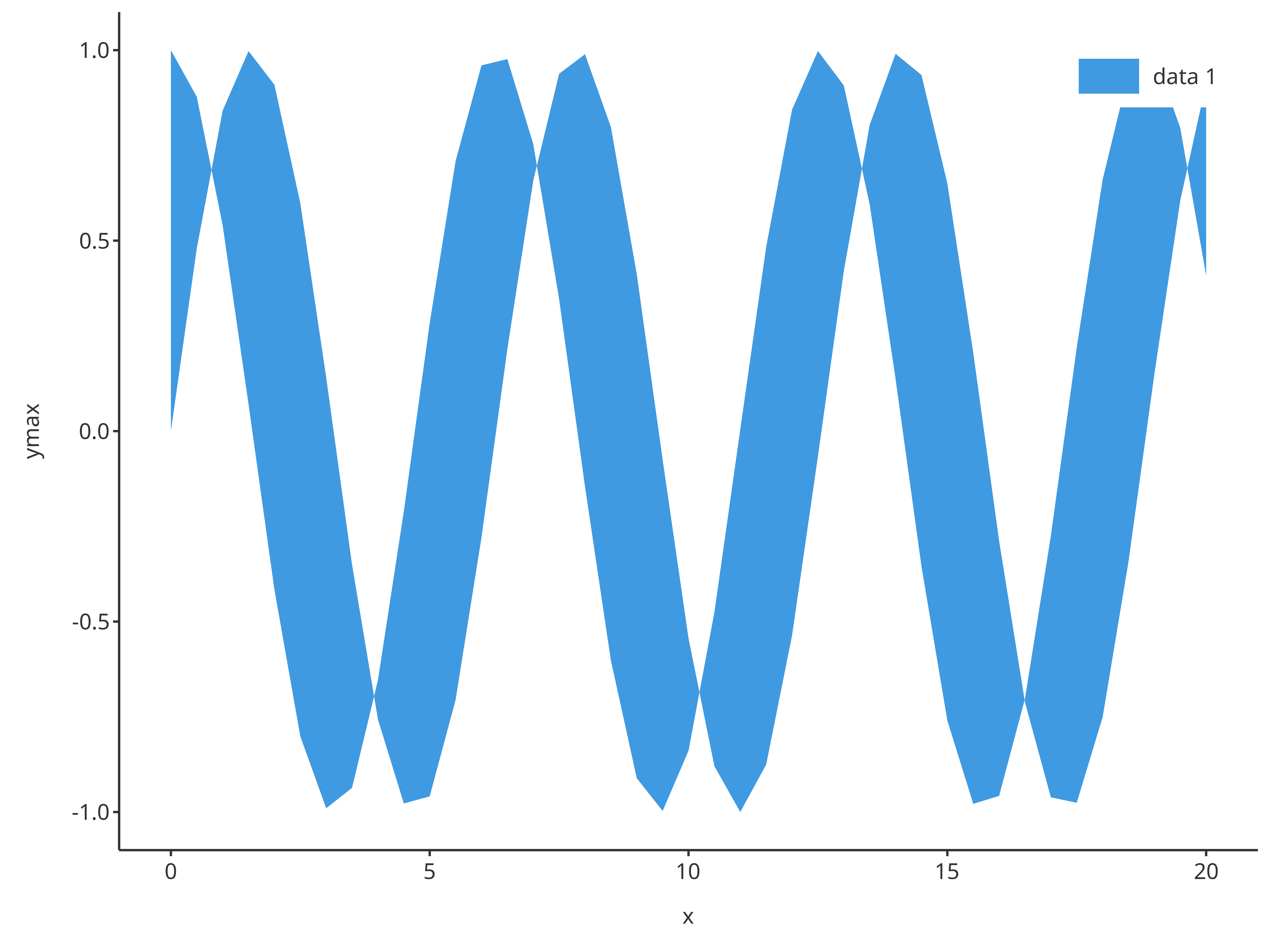
addRibbon
The function addRibbon returns a ribbon plot. Ribbons
require ymin and ymax inputs. Consequently, a
different dataMapping of type RangeDataMapping is
necessary compared to addLine and addScatter
that require XYGDataMapping.
sinCosMapping <- RangeDataMapping$new(
  x = "time",
  ymin = "sin",
  ymax = "cos"
)

addRibbon(
  data = cosData,
  metaData = cosMetaData,
  dataMapping = sinCosMapping
)
The function addRibbon also supports x,
ymin and ymax inputs instead of
data and its dataMapping.
addRibbon(
  x = cosData$time,
  ymin = cosData$sin,
  ymax = cosData$cos
)
For ribbons, optional inputs include fill and
alpha defining the color and transparency of the ribbon,
respectively.
addRibbon(
  x = cosData$time,
  ymin = cosData$sin,
  ymax = cosData$cos,
  fill = "firebrick",
  alpha = 0.5,
  caption = "ribbon plot"
)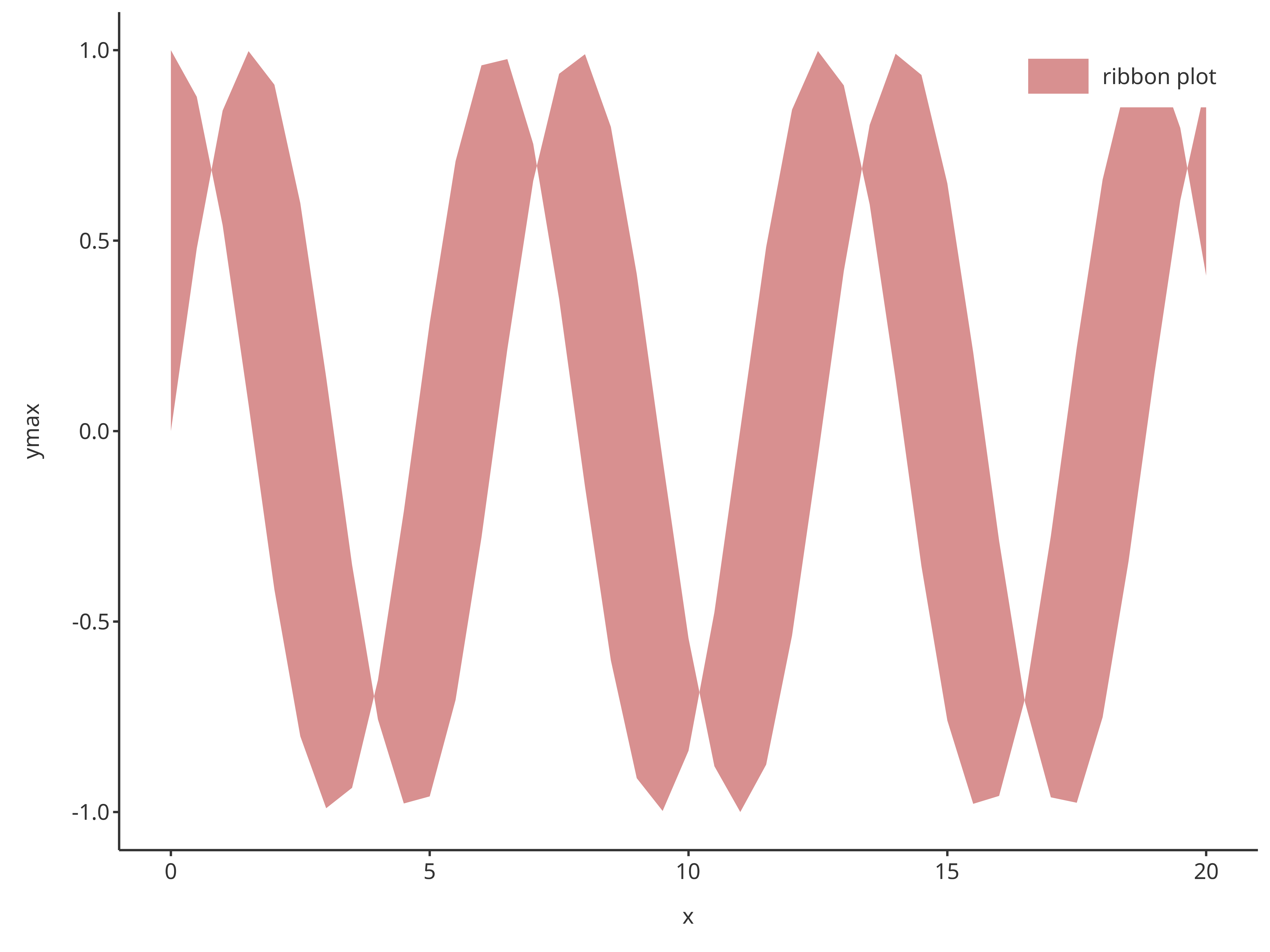
Note that transparency input, alpha, is a value between
0 and 1. The closer to 0, the more transparent the fill
color is. The closer to 1, the more visible the fill color
is.
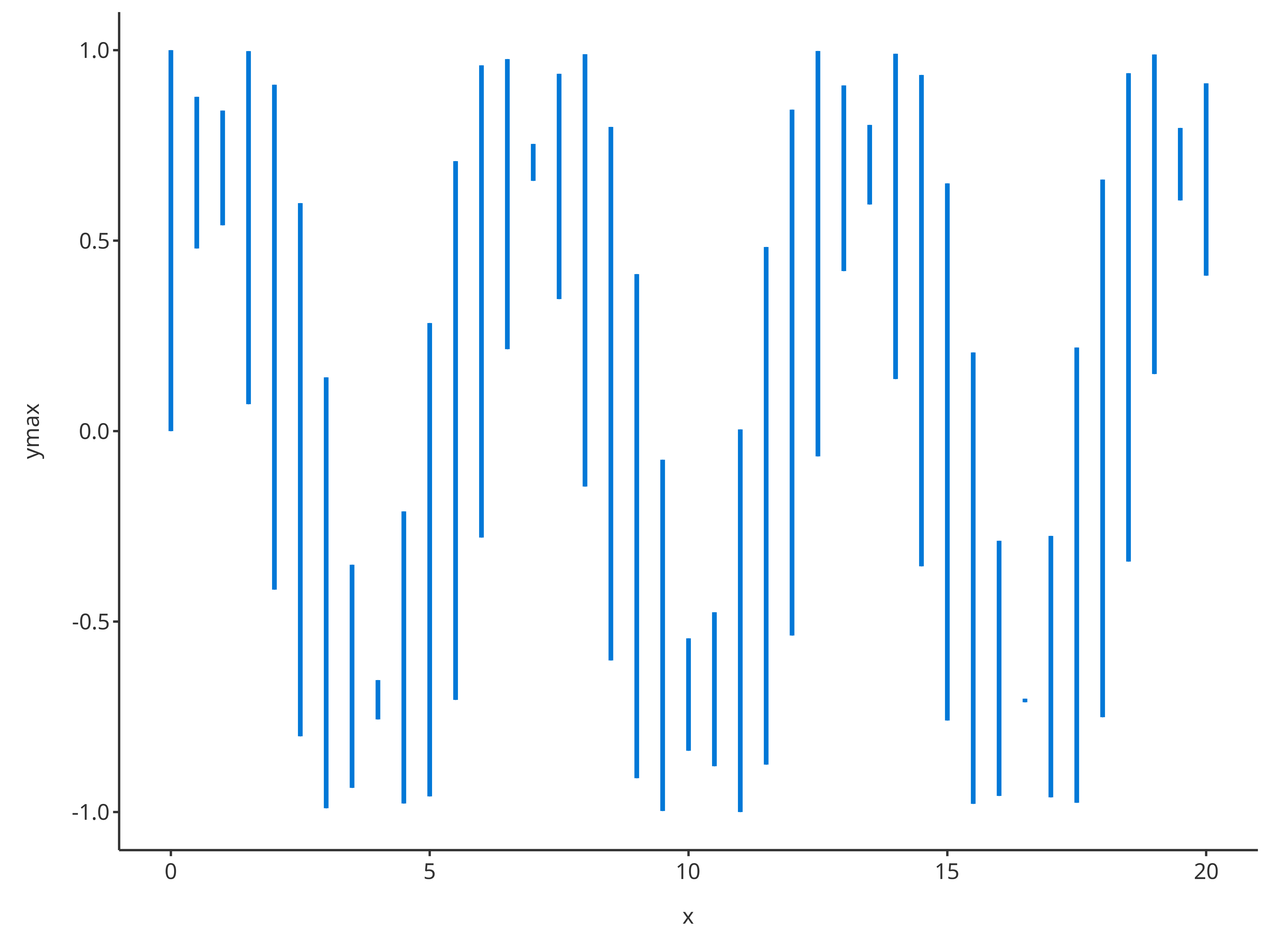
addErrorbar
The function addErrorbar returns an error bar plot. As
for ribbons, error bars require ymin and ymax
inputs.
addErrorbar(
  x = cosData$time,
  ymin = cosData$sin,
  ymax = cosData$cos
)
Among its optional inputs, addErrorbar proposes
capSize a numeric that defines the size of the extremities
of the error bars (caps).
addErrorbar(
  x = cosData$time,
  ymin = cosData$sin,
  ymax = cosData$cos,
  color = "firebrick",
  linetype = Linetypes$solid,
  capSize = 5,
  size = 0.5,
  caption = "error bar plot"
)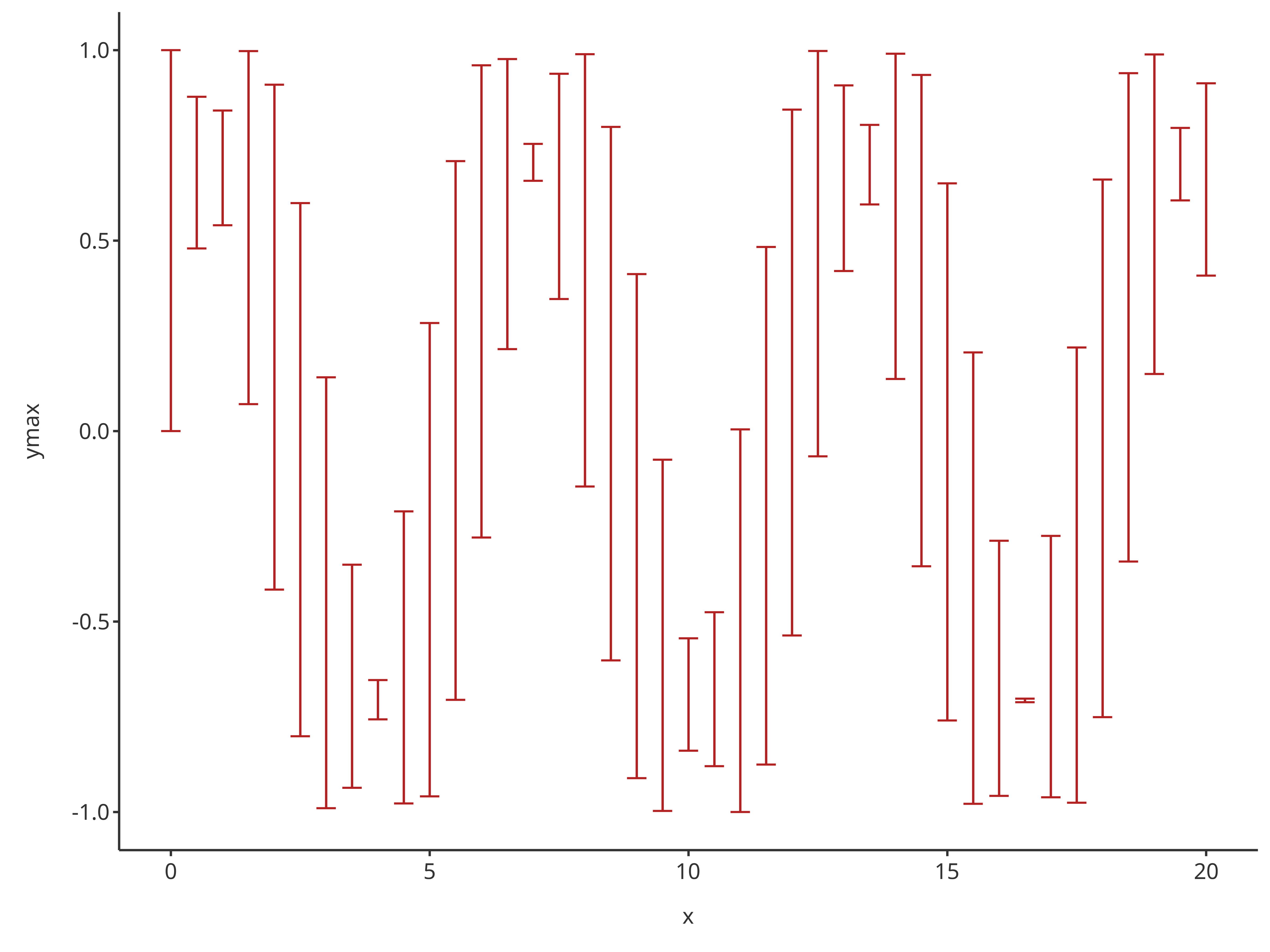
Note that optional inputs for addErrorbar define the
aesthetic of the bars only (and not how to link the bars). Thus, two
layers are necessary when creating a plot that included both data and
their error bars.
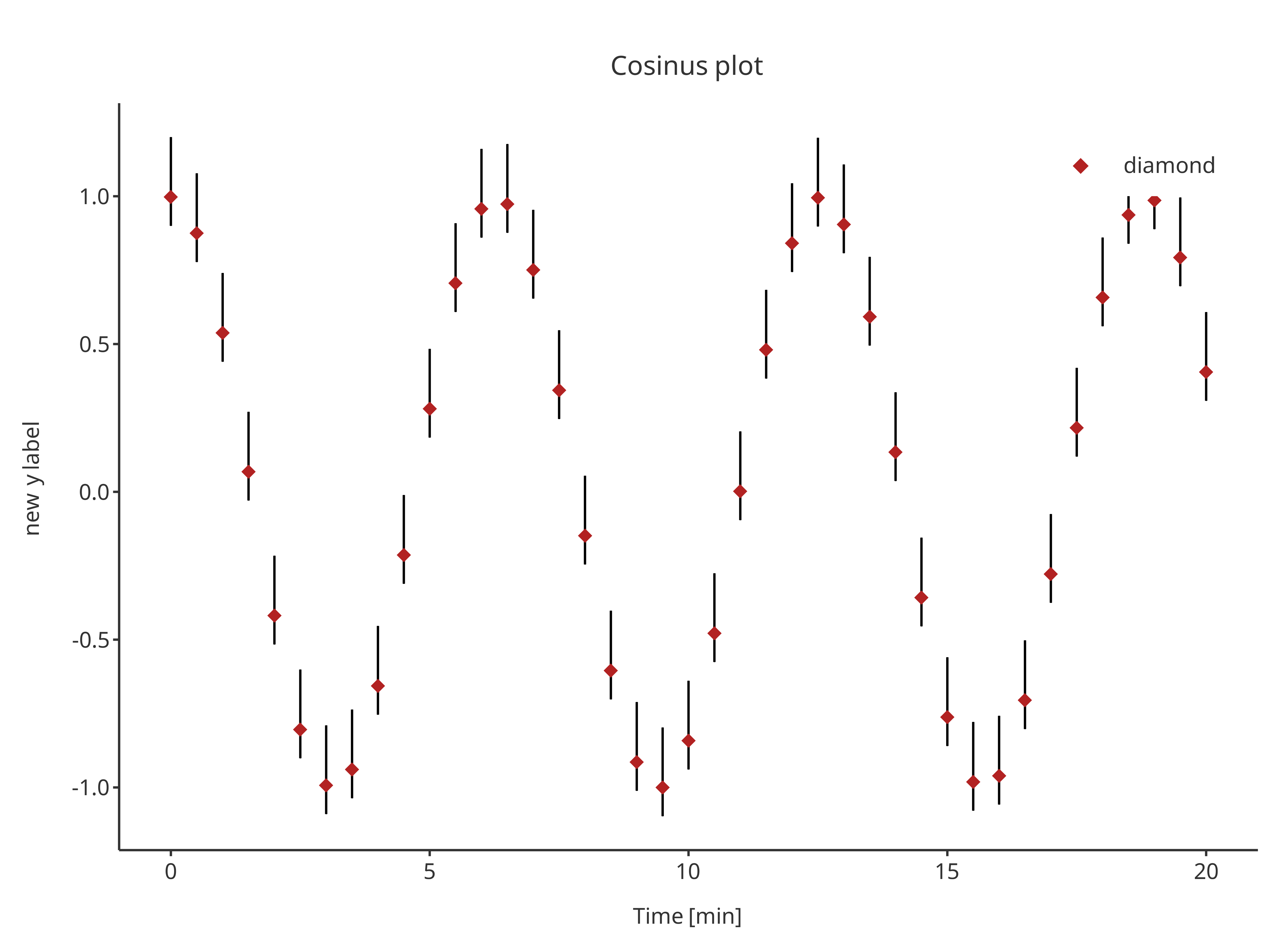
errorPlot <- addErrorbar(
  x = cosData$time,
  ymin = cosData$cos - 0.1,
  ymax = cosData$cos + 0.2,
  caption = "error",
  color = "black",
  size = 0.5,
  plotConfiguration = overwriteConfiguration
)

errorPlot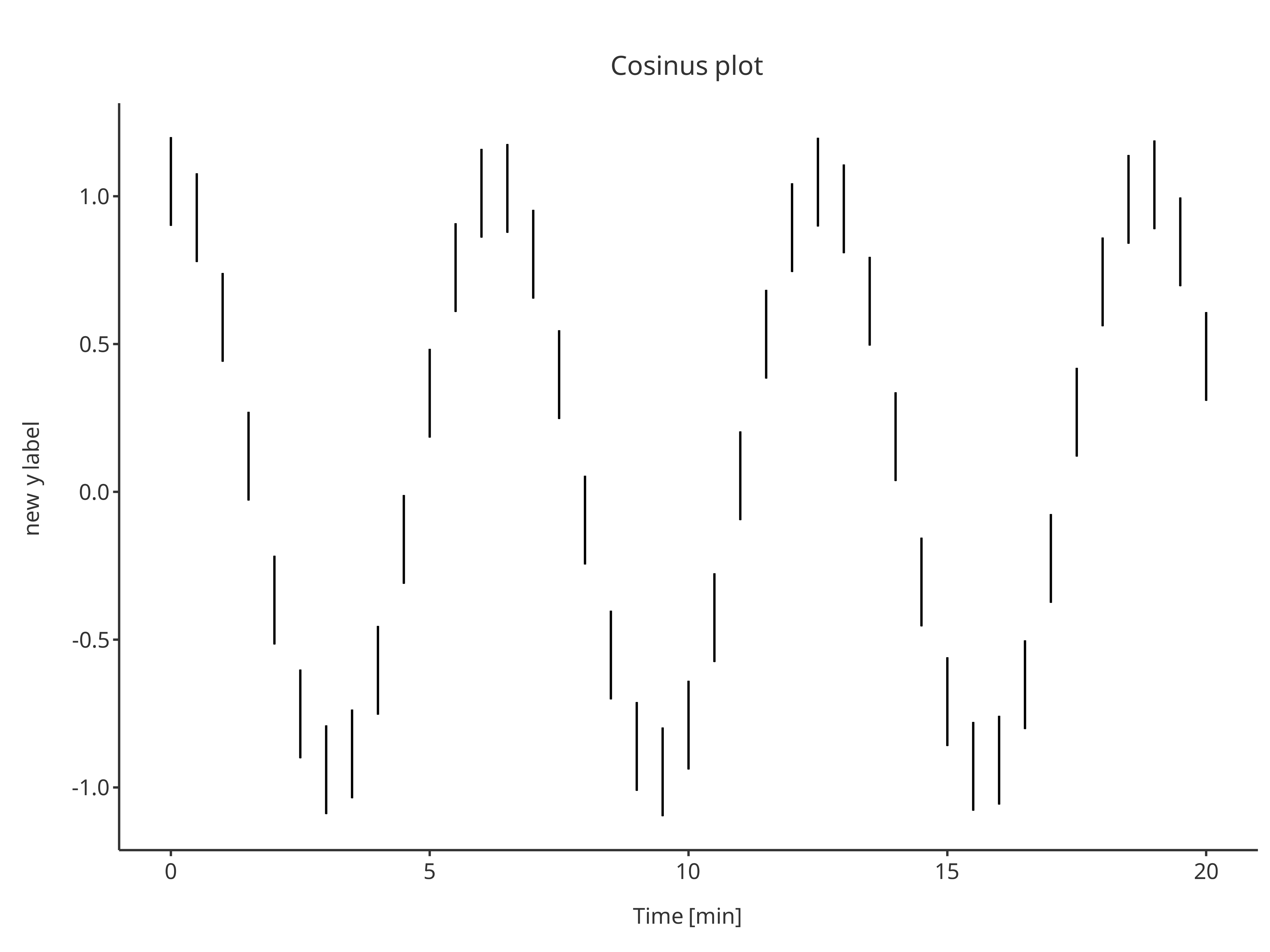
addScatter(
  x = cosData$time,
  y = cosData$cos,
  color = "firebrick",
  shape = Shapes$diamond,
  size = 3,
  caption = "diamond",
  plotObject = errorPlot
)