1. Introduction
The following vignette aims at documenting and illustrating workflows
for producing box-and-whisker plots using the
tlf-Library.
This vignette focuses boxplot examples. Detailed documentation on
typical tlf workflow, use of
AgregationSummary, DataMapping,
PlotConfiguration and Theme can be found in
vignette("tlf-workflow").
2. Definition of the boxplot functions and classes
2.1. The plotBoxWhisker function
The function for plotting box-whiskers is:
plotBoxWhisker. Basic documentation of the function can be
found using: ?plotBoxWhisker. The typical usage of this
function is:
plotBoxWhisker(data, metaData = NULL, dataMapping = NULL, plotConfiguration = NULL).
The output of the function is a ggplot object.
2.2. The BoxWhiskerDataMapping class
The dataMapping from plotBoxWhisker
requires a BoxWhiskerDataMapping class. This class can
simply be initialized by BoxWhiskerDataMapping$new(),
needing y variable name input only. For boxplots with
multiple boxes, x variable name and/or fill
groupMapping can be used. The x variable is expected to be
factor levels. Beside these common input, it is possible to overwrite
the aggregation functions that plot the edges of the box, the whiskers
and the outlying data.
- For the box edges
lower,middle, anduppercorrespond to the first quartile, median, and the third quartile (25th, 50th, and 75th percentiles), respectively. - For the whiskers,
yminandymaxuse the 5th and 95th percentiles. - For outliers, points lower than the 25th percentile - 1.5 x IQR and points higher than 75th percentile + 1.5 x IQR (where IQR is the inter-quartile range) are flagged and plotted.
In order to help with the boxplot aggregation functions, a bank of
predefined function names is already available in the tlfStatFunctions
(as an enum). Consequently, a tree with the available predefined
function names will appear when writing tlfStatFunctions$:
‘mean’, ‘sd’, ‘min’, ‘max’, ‘mean-sd’, ‘mean+sd’, ‘mean-1.96sd’,
‘mean+1.96sd’, ‘Percentile0%’, ‘Percentile1%’, ‘Percentile2.5%’,
‘Percentile5%’, ‘Percentile10%’, ‘Percentile15%’, ‘Percentile20%’,
‘Percentile25%’, ‘Percentile50%’, ‘Percentile75%’, ‘Percentile80%’,
‘Percentile85%’, ‘Percentile90%’, ‘Percentile95%’, ‘Percentile97.5%’,
‘Percentile99%’, ‘Percentile100%’, ‘median-IQR’, ‘median+IQR’,
‘median-1.5IQR’, ‘median+1.5IQR’, ‘Percentile25%-1.5IQR’,
‘Percentile75%+1.5IQR’,
3. Examples
3.1. Data
To illustrate the workflow to produce boxplots, let’s use the
pkRatioDataExample.RData example data from the
extdata folder.
It includes the dataset pkRatioData:
# Load example
pkRatioData <- read.csv(
  system.file("extdata", "test-data.csv", package = "tlf"),
  stringsAsFactors = FALSE
)

# pkRatioData
knitr::kable(utils::head(pkRatioData), digits = 2)| ID | Age | Obs | Pred | Ratio | AgeBin | Sex | Country | SD |
|---|---|---|---|---|---|---|---|---|
| 1 | 48 | 4.00 | 2.90 | 0.72 | Adults | Male | Canada | 0.69 |
| 2 | 36 | 4.40 | 5.75 | 1.31 | Adults | Male | Canada | 0.19 |
| 3 | 52 | 2.80 | 2.70 | 0.96 | Adults | Male | Canada | 0.98 |
| 4 | 47 | 3.75 | 3.05 | 0.81 | Adults | Male | Canada | 0.59 |
| 5 | 0 | 1.95 | 5.25 | 2.69 | Peds | Male | Canada | 0.44 |
| 6 | 48 | 2.45 | 5.30 | 2.16 | Adults | Male | Canada | 0.07 |
We will also need to prepare a corresponding metaData
pkRatioMetaData:
# Load example
pkRatioMetaData <- list(
  Age = list(
    dimension = "Age",
    unit = "yrs"
  ),
  Obs = list(
    dimension = "Clearance",
    unit = "dL/h/kg"
  ),
  Pred = list(
    dimension = "Clearance",
    unit = "dL/h/kg"
  ),
  Ratio = list(
    dimension = "Ratio",
    unit = ""
  )
)
knitr::kable(data.frame(
  Variable = c("Age", "Obs", "Pred", "Ratio"),
  Dimension = c("Age", "Clearance", "Clearance", "Ratio"),
  Unit = c("yrs", "dL/h/kg", "dL/h/kg", "")
))| Variable | Dimension | Unit |
|---|---|---|
| Age | Age | yrs |
| Obs | Clearance | dL/h/kg |
| Pred | Clearance | dL/h/kg |
| Ratio | Ratio |
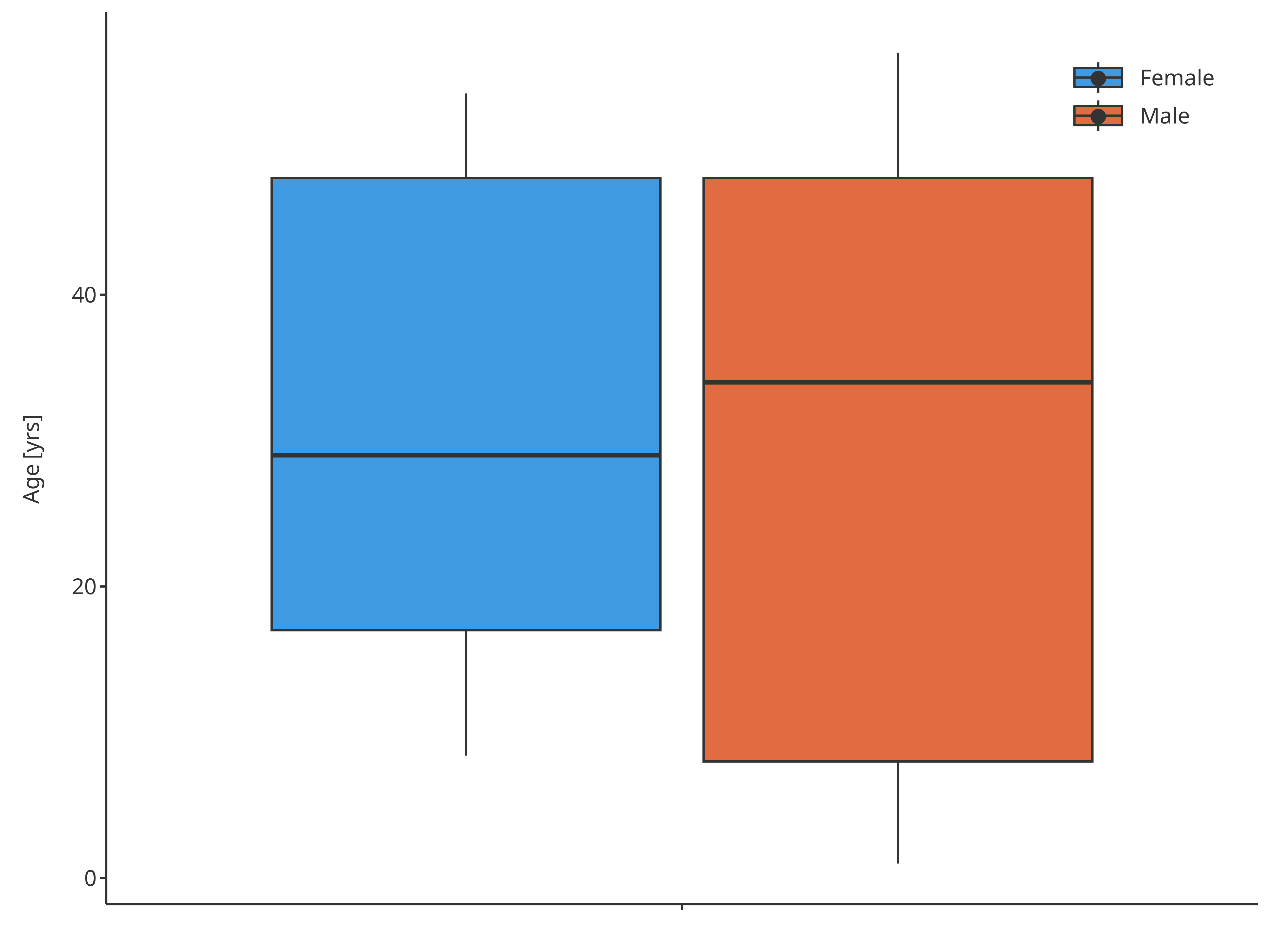
3.2. Minimal example
In the minimal example, only the basic y variable name
is indicated. Here, "Age" was chosen for the boxplot.
minMap <- BoxWhiskerDataMapping$new(y = "Age")

minBoxplot <- plotBoxWhisker(
  data = pkRatioData,
  metaData = pkRatioMetaData,
  dataMapping = minMap
)
minBoxplot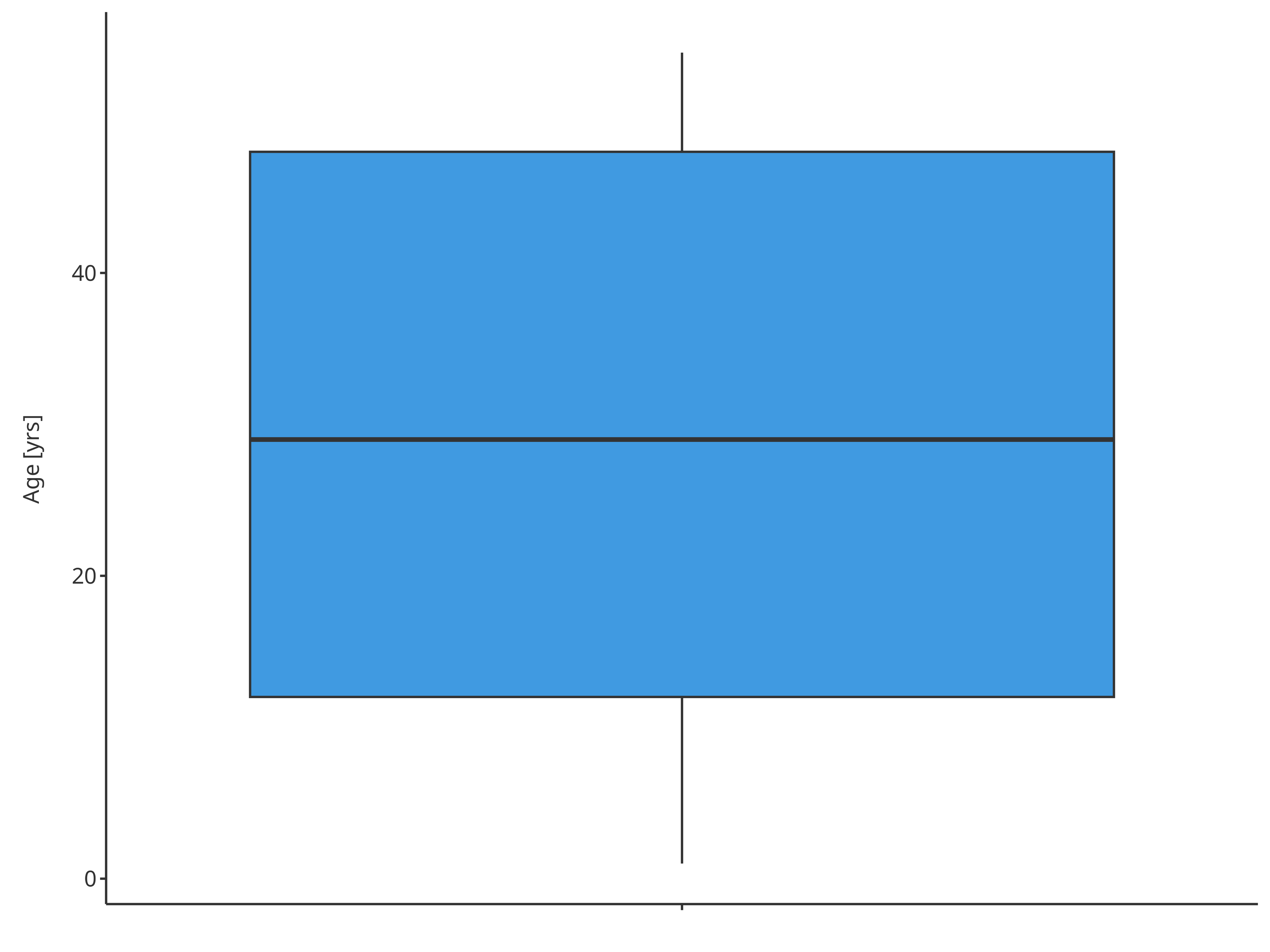
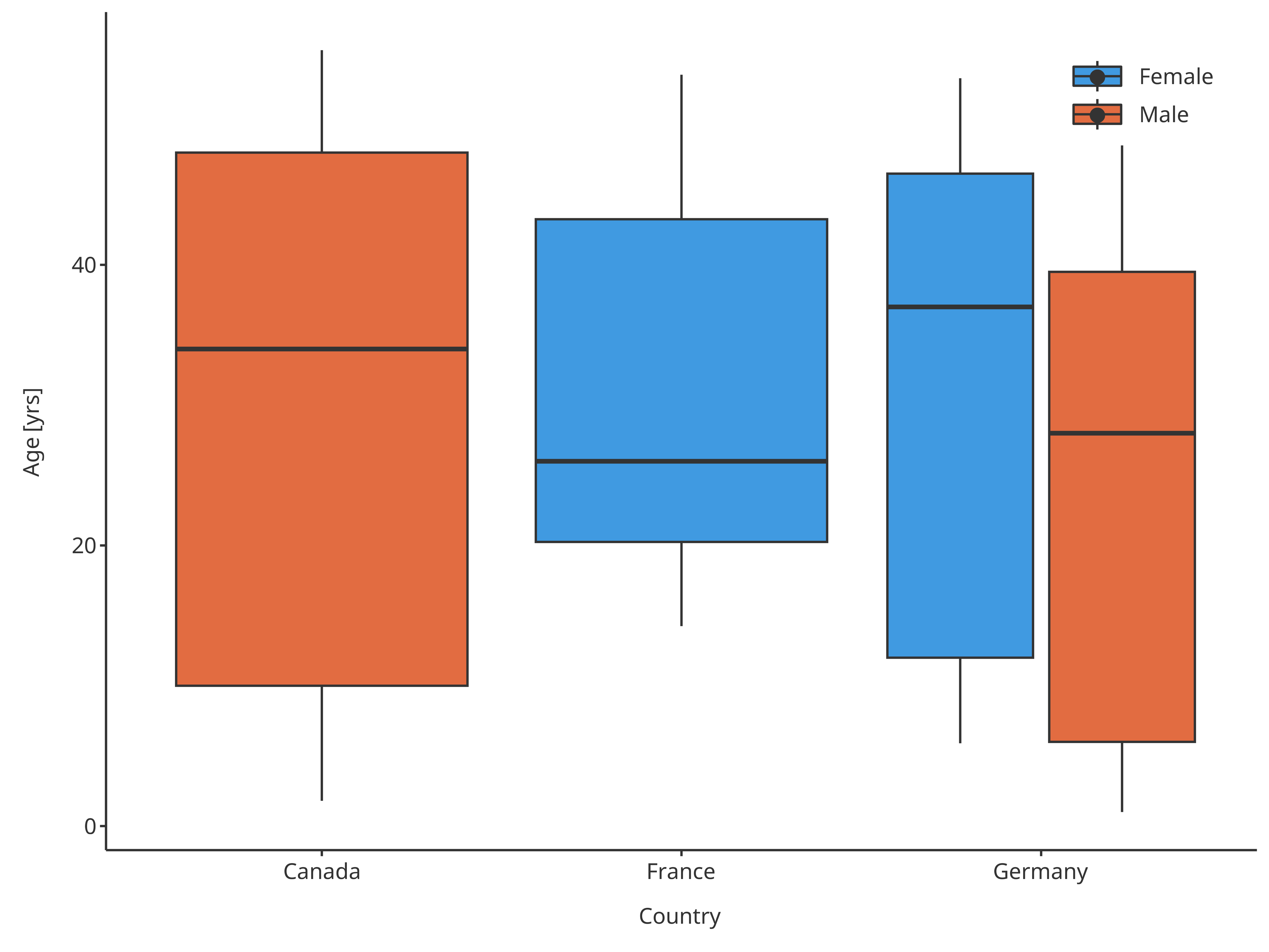
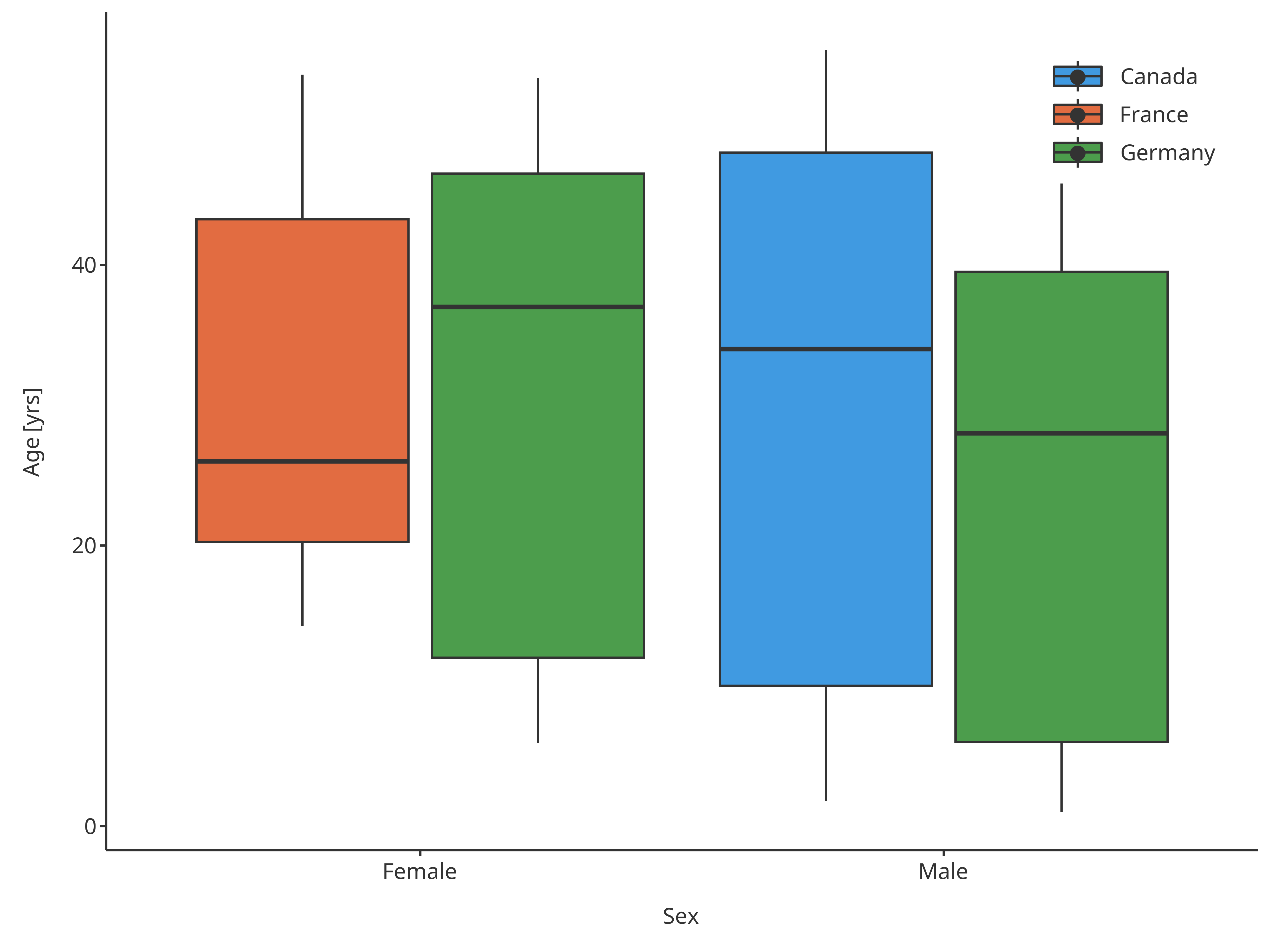
3.3. Difference x vs fill input
In this plot, x and/or fill can be
provided. If only x is provided, the plot will use the
x variable for aggregation and the boxplots will be
displayed according to x. If providing fill,
the plot will use the fill groupMapping for aggregation and
the boxplots will be displayed around the same x but
comparing the color filling. Consequently, the fill
variable is useful when performing a double comparison.
In the example below, "Country" and "Sex"
can both be used for comparison of "Age".
xPopMap <- BoxWhiskerDataMapping$new(
  x = "Country",
  y = "Age"
)

xSexMap <- BoxWhiskerDataMapping$new(
  x = "Sex",
  y = "Age"
)

fillPopMap <- BoxWhiskerDataMapping$new(
  y = "Age",
  fill = "Country"
)

fillSexMap <- BoxWhiskerDataMapping$new(
  y = "Age",
  fill = "Sex"
)
xPopFillSexMap <- BoxWhiskerDataMapping$new(
  x = "Country",
  y = "Age",
  fill = "Sex"
)

xSexFillPopMap <- BoxWhiskerDataMapping$new(
  x = "Sex",
  y = "Age",
  fill = "Country"
)
plotBoxWhisker(
  data = pkRatioData,
  metaData = pkRatioMetaData,
  dataMapping = xPopMap
)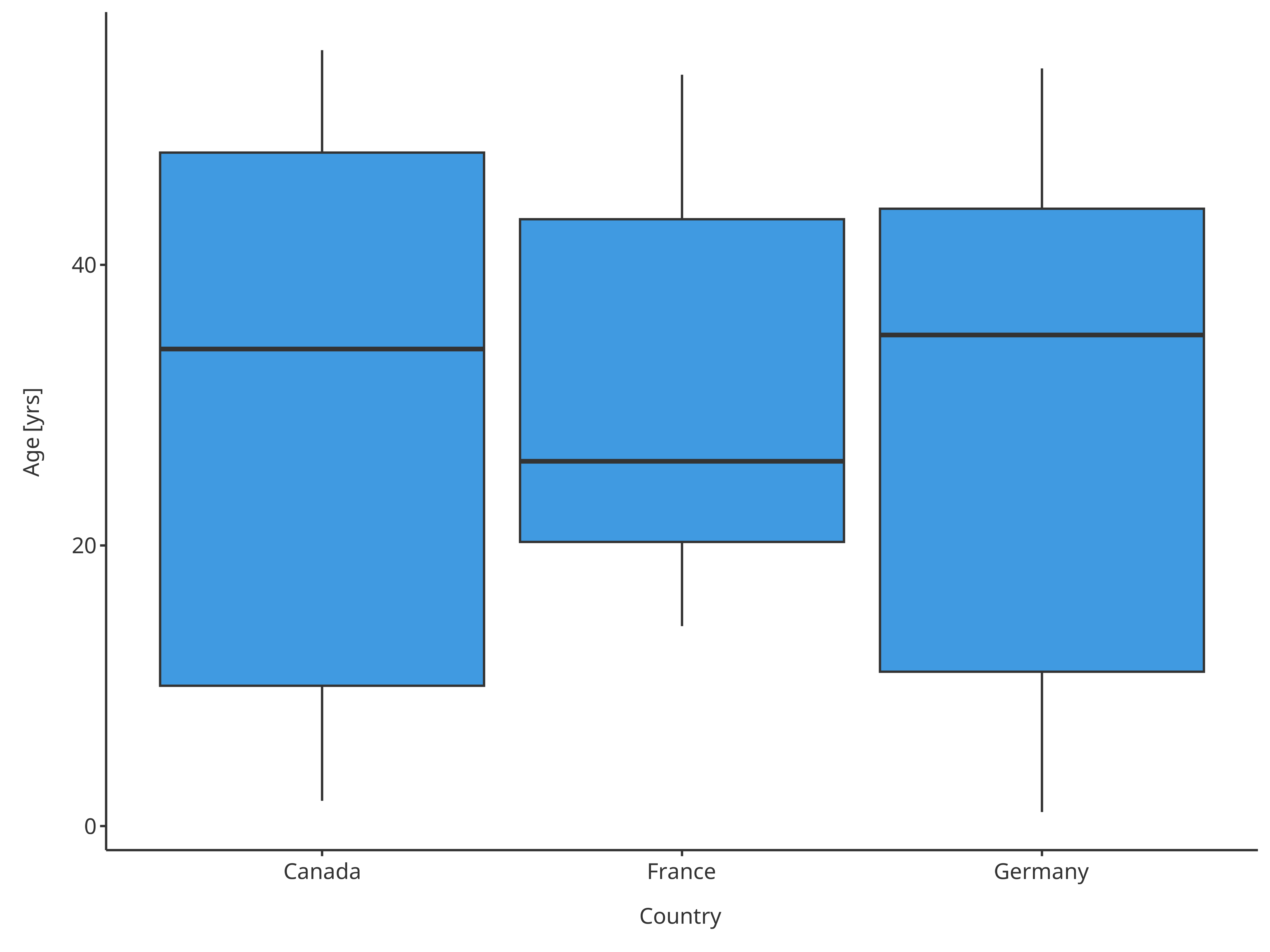
Boxplot mapping Country as x
Note that the sample from a given country sometimes did not have any individual from one of the sexes.
plotBoxWhisker(
  data = pkRatioData,
  metaData = pkRatioMetaData,
  dataMapping = xSexMap
)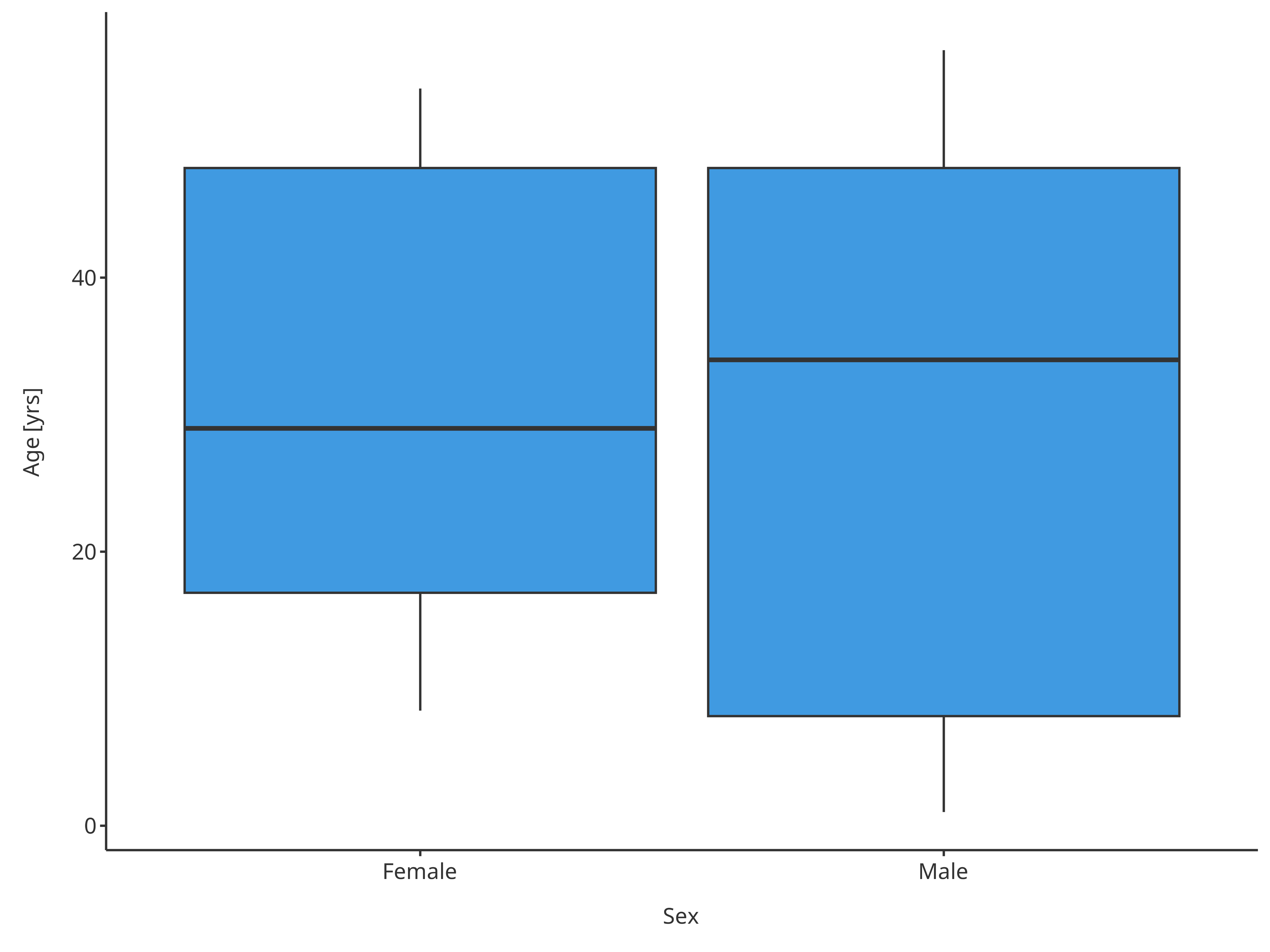
Boxplot mapping Sex as x
plotBoxWhisker(
  data = pkRatioData,
  metaData = pkRatioMetaData,
  dataMapping = fillPopMap
)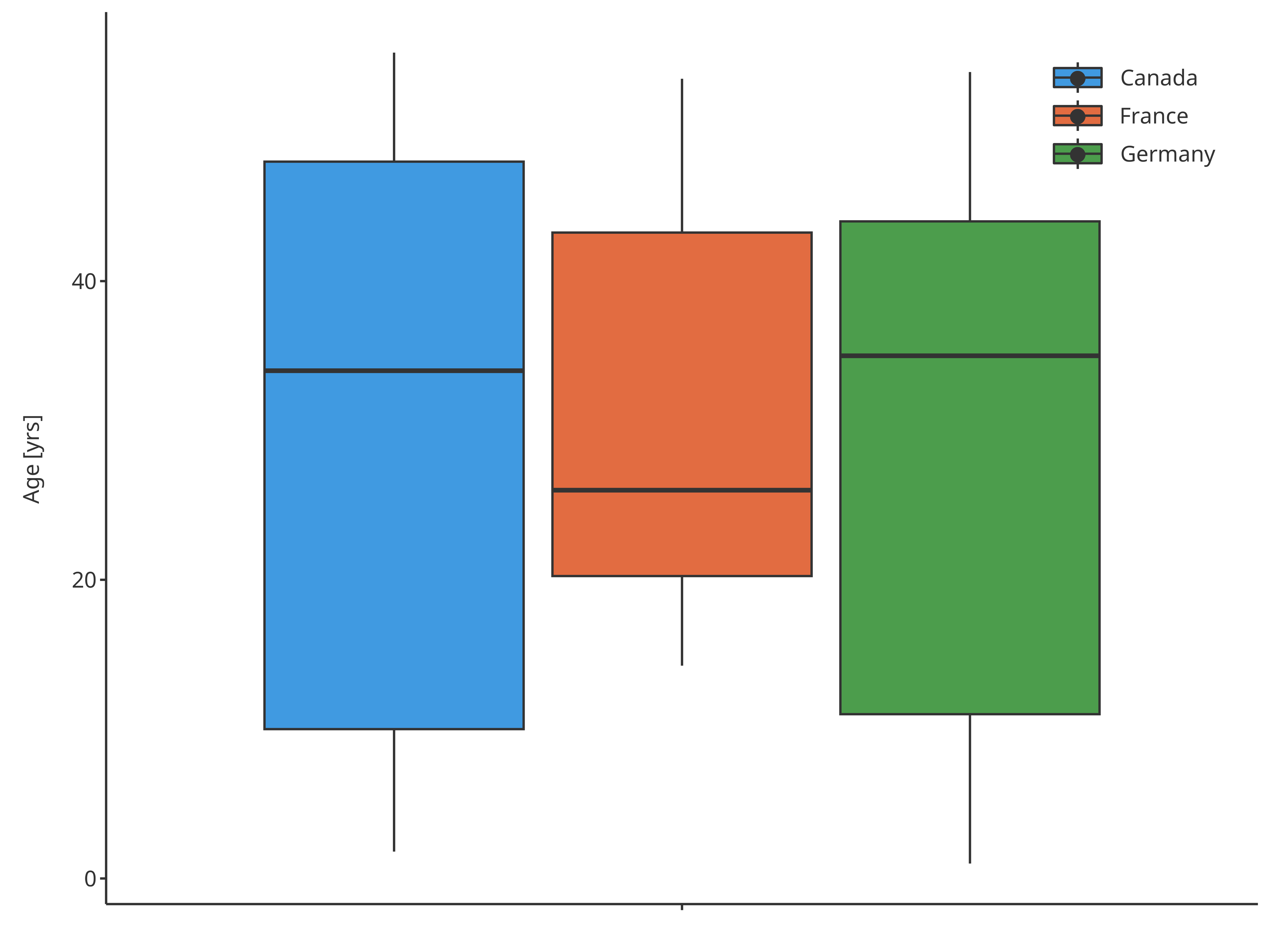
Boxplot mapping Country as fill
plotBoxWhisker(
  data = pkRatioData,
  metaData = pkRatioMetaData,
  dataMapping = fillSexMap
)
Boxplot mapping Sex as fill
plotBoxWhisker(
  data = pkRatioData,
  metaData = pkRatioMetaData,
  dataMapping = xPopFillSexMap
)
Boxplot mapping Country as x and Sex as fill
plotBoxWhisker(
  data = pkRatioData,
  metaData = pkRatioMetaData,
  dataMapping = xSexFillPopMap
)
Boxplot mapping Sex as x and Country as fill
3.4. Boxplot functions
In some cases, displaying 5th and 95th percentiles is not necessary. For instance, when a normal distribution is assumed, mean +/- 1.96 standard deviation would be preferred. In these cases, it is easy to overwrite the default functions by specifying either using a home made function or directly using predefined functions as suggested in section 2.2.
In the following examples, the boxplot will use the mean for the middle line and mean +/- 1.96 standard deviation for the whiskers:
normMap <- BoxWhiskerDataMapping$new(
  x = "Country",
  y = "Age",
  fill = "Sex",
  ymin = tlfStatFunctions$`mean-1.96sd`,
  middle = tlfStatFunctions$mean,
  ymax = tlfStatFunctions$`mean+1.96sd`
)

normBoxplot <- plotBoxWhisker(
  data = pkRatioData,
  metaData = pkRatioMetaData,
  dataMapping = normMap
)
normBoxplot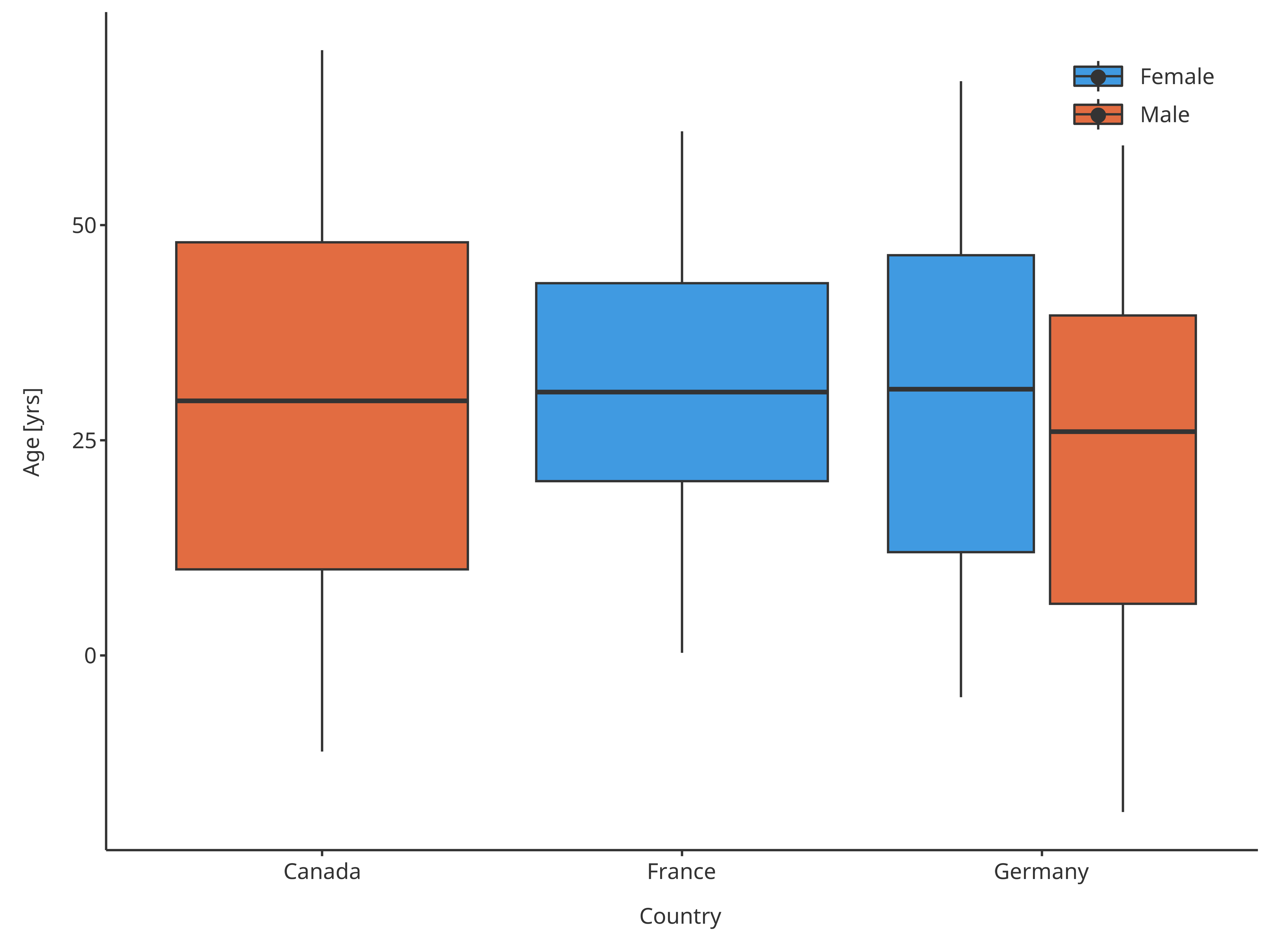
Boxplot mapping Country as x, Sex as fill and assuming normal distribution
In this example, the boxplot use also mean +/- standard deviation for the box edges
normMap2 <- BoxWhiskerDataMapping$new(
  x = "Country",
  y = "Age",
  fill = "Sex",
  ymin = tlfStatFunctions$`mean-1.96sd`,
  lower = tlfStatFunctions$`mean-sd`,
  middle = tlfStatFunctions$mean,
  upper = tlfStatFunctions$`mean+sd`,
  ymax = tlfStatFunctions$`mean+1.96sd`
)

normBoxplot2 <- plotBoxWhisker(
  data = pkRatioData,
  metaData = pkRatioMetaData,
  dataMapping = normMap2
)
normBoxplot2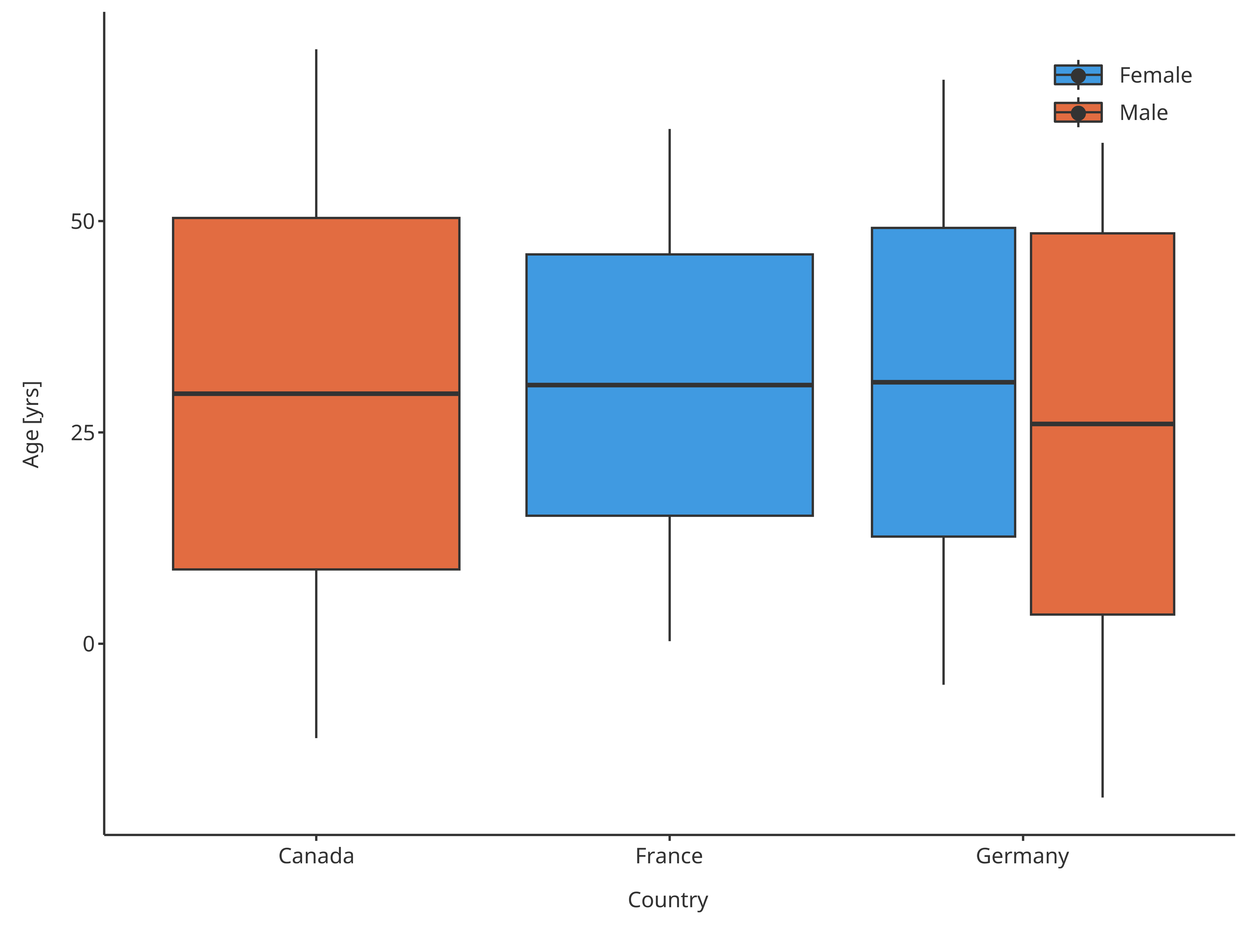
Boxplot mapping Country as x, Sex as fill and assuming normal distribution
Important: If you override the defaults this way, please make sure to specify this in the plot annotations as you are basically redefining a boxplot and the reader might not be aware of this and will misinterpret the plot.
3.5. Outlier functions
Default outliers are flagged when outside the range from 25th
percentiles - 1.5 x IQR to 75th percentiles + 1.5 x IQR, as suggested by
McGill and implemented by the current boxplot functions from ggplot
(geom_boxplot). However, these default can also be
overridden.
In the following example, outliers will be flagged when values are out of the 10th-90th percentiles, while whiskers will go until these same percentiles:
outlierMap <- BoxWhiskerDataMapping$new(
  x = "Country",
  y = "Age",
  fill = "Sex",
  ymin = tlfStatFunctions$`Percentile10%`,
  ymax = tlfStatFunctions$`Percentile90%`,
  minOutlierLimit = tlfStatFunctions$`Percentile10%`,
  maxOutlierLimit = tlfStatFunctions$`Percentile90%`
)

outlierBoxplot <- plotBoxWhisker(
  data = pkRatioData,
  metaData = pkRatioMetaData,
  dataMapping = outlierMap
)
outlierBoxplot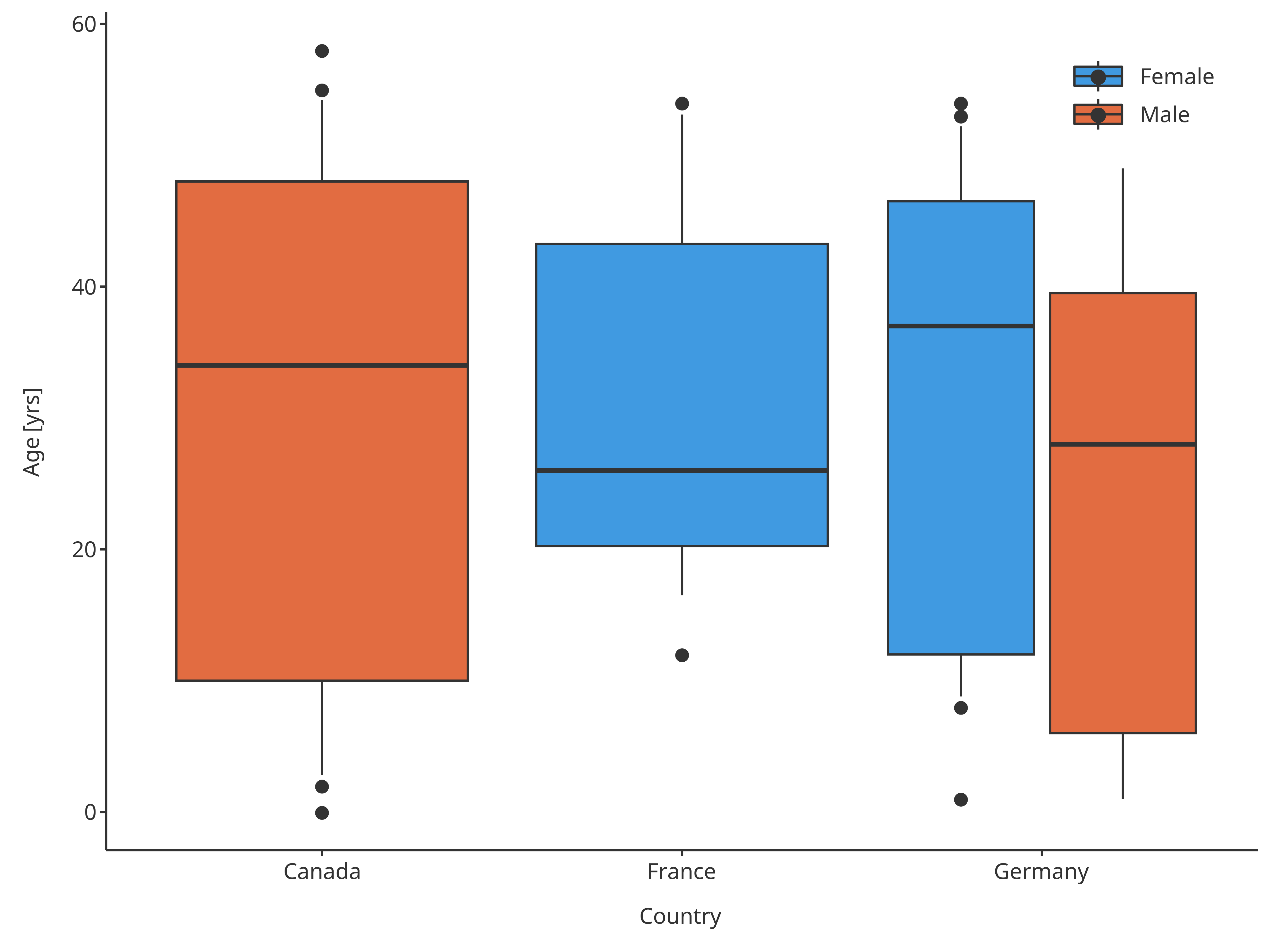
Boxplot mapping Country as x, Sex as fill and assuming normal distribution
3.4. plotConfiguration of boxplots:
BoxWhiskerPlotConfiguration
To define the properties of the boxes and points of the box whisker plots, a BoxWhiskerPlotConfiguration object can be defined to overwrite the default properties. The ribbons and points fields will define how the boxes and outliers will be handled.
Using the previous example where country was defined in
x and gender as color.
# Define a PlotConfiguration object using smart mapping
boxplotConfiguration <- BoxWhiskerPlotConfiguration$new(
  data = pkRatioData,
  metaData = pkRatioMetaData,
  dataMapping = xPopFillSexMap
)

# Change the properties of the box colors
boxplotConfiguration$ribbons$fill <- c("pink", "dodgerblue")
boxplotConfiguration$ribbons$color <- "orange"

# Change the properties of the points (outliers)
boxplotConfiguration$points$size <- 2
boxplotConfiguration$points$shape <- Shapes$diamond

plotBoxWhisker(
  data = pkRatioData,
  metaData = pkRatioMetaData,
  dataMapping = xPopFillSexMap,
  plotConfiguration = boxplotConfiguration
)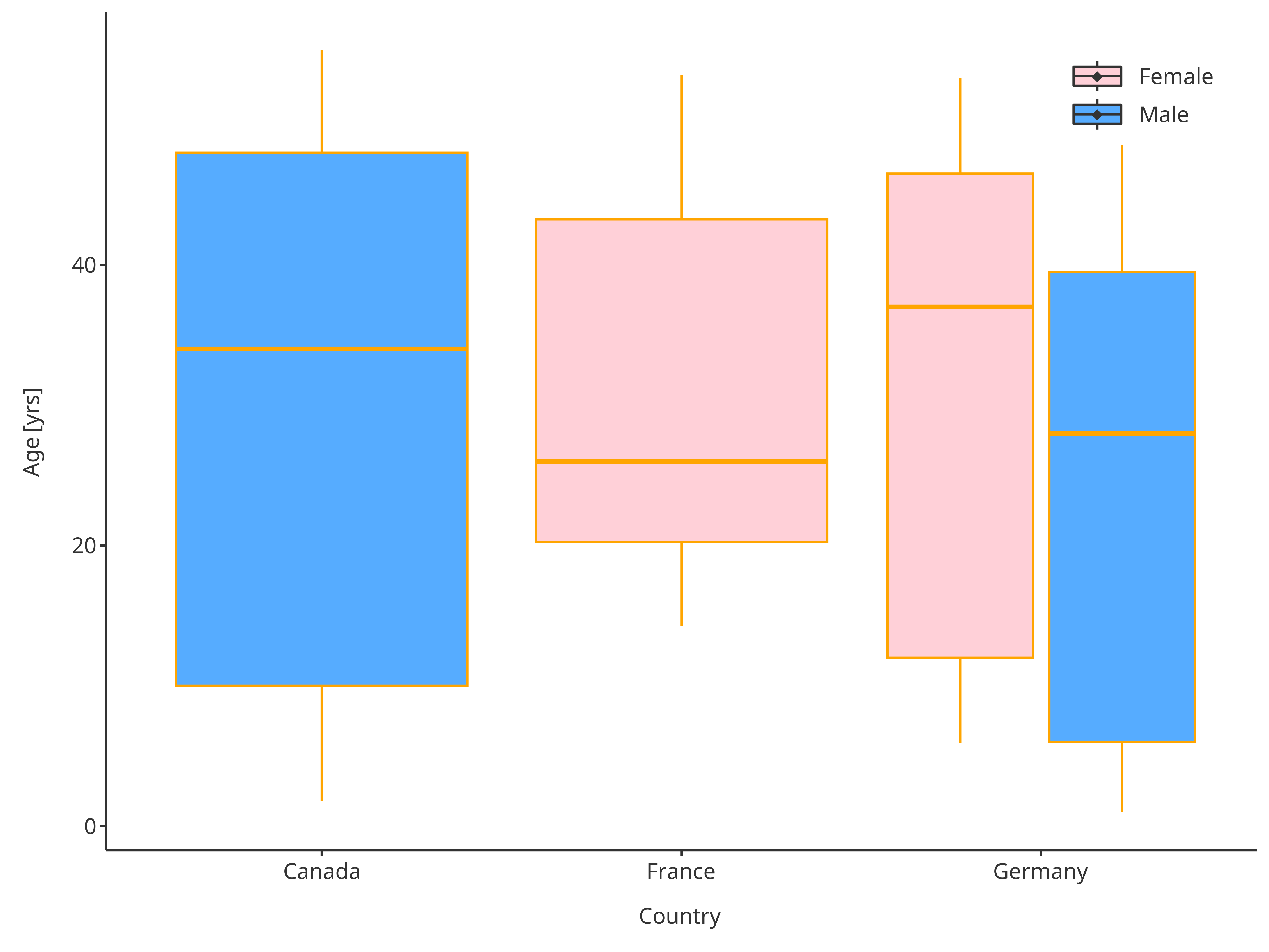
Boxplot with updated plot configuration
4. Further utility of BoxWhiskerDataMapping
Since the boxplot data mapping performs an aggregation of the data,
it possible to get directly the resulting aggregated statistic as a
table using getBoxWhiskerLimits(). Similarly, it can be
used to flag any values out of a certain range using
getOutliers().
For instance, using the example from section 3.5, one can get the following results
boxplotSummary <- outlierMap$getBoxWhiskerLimits(pkRatioData)

knitr::kable(boxplotSummary, digits = 2)| Country | Sex | ymin | lower | middle | upper | ymax | legendLabels |
|---|---|---|---|---|---|---|---|
| France | Female | 16.5 | 20.25 | 26 | 43.25 | 53.1 | |
| Germany | Female | 8.8 | 12.00 | 37 | 46.50 | 52.2 | |
| Canada | Male | 2.8 | 10.00 | 34 | 48.00 | 54.2 | |
| Germany | Male | 1.0 | 6.00 | 28 | 39.50 | 49.0 |
outliers <- outlierMap$getOutliers(pkRatioData)
outliers <- outliers[, c("Age", "minOutlierLimit", "maxOutlierLimit", "minOutliers", "maxOutliers")]

knitr::kable(utils::head(outliers), digits = 2)| Age | minOutlierLimit | maxOutlierLimit | minOutliers | maxOutliers |
|---|---|---|---|---|
| 48 | 2.8 | 54.2 | NA | NA |
| 36 | 2.8 | 54.2 | NA | NA |
| 52 | 2.8 | 54.2 | NA | NA |
| 47 | 2.8 | 54.2 | NA | NA |
| 0 | 2.8 | 54.2 | 0 | NA |
| 48 | 2.8 | 54.2 | NA | NA |