Goodness of fit
goodness-of-fit.Rmd1. Introduction
The ospsuite.plots library provides functions to compare
predicted and observed data and resulting residuals:
-
plotPredVsObs()(see section 2): plot predicted values versus corresponding observed values. -
plotResVsCov()(see section 3): plot residuals as points versus a covariate (e.g., Time, observed values, or Age). -
plotRatioVsCov()(see section 4): plot ratios as points versus a covariate (e.g., Time, observed values, or Age). -
plotQQ()(see section 5): Quantile-Quantile plot.
For DDI comparison, the functions plotPredVsObs() and
plotResVsObs() can be overlaid with lines indicating the
limits of the Guest Criteria (https://dmd.aspetjournals.org/content/39/2/170) (see
section 2.4 and 4.3).
Note: Residual calculation is not performed within
ospsuite.plots. Residuals and ratios need to be pre-calculated before passing them to the plotting functions. If you are using the{ospsuite}package, you can useospsuite::addResidualColumn()to add a residual column to your data.
The functions plotPredVsObs(),
plotResVsCov(), and plotRatioVsCov() are
mainly wrappers around the function plotYVsX(), using
different defaults for input variables. So, use ?plotYVsX
to get more details.
1.1 Setup
This vignette uses the ospsuite.plots and tidyr libraries. We will use the default settings of ospsuite.plots (see vignette(“ospsuite.plots”, package = “ospsuite.plots”)).
options(rmarkdown.html_vignette.check_title = FALSE)

library(ospsuite.plots)
library(tidyr)

oldDefaults <- setDefaults()
1.2 Example Data
This vignette uses two randomly generated example datasets provided by the package.
1.2.1 Dataset with Predicted and Observed Data
data <- exampleDataCovariates |>
  dplyr::filter(SetID == "DataSet2") |>
  dplyr::select(c("ID", "Age", "Obs", "gsd", "Pred", "Sex"))

knitr::kable(head(data), digits = 3, caption = "First rows of example data.")| ID | Age | Obs | gsd | Pred | Sex |
|---|---|---|---|---|---|
| 1 | 44 | 28.808 | 1.009 | 32.535 | Female |
| 2 | 23 | 77.476 | 0.992 | 76.418 | Male |
| 3 | 26 | 35.861 | 1.028 | 34.282 | Female |
| 4 | 20 | 62.711 | 1.072 | 55.015 | Male |
| 5 | 21 | 30.475 | 1.045 | 29.751 | Female |
| 6 | 48 | 74.238 | 0.989 | 67.357 | Male |
metaData <- attr(exampleDataCovariates, "metaData")
metaData <- metaData[intersect(names(data), names(metaData))]
knitr::kable(metaData2DataFrame(metaData), digits = 2, caption = "List of meta data")| Age | Obs | Pred | |
|---|---|---|---|
| dimension | Age | Clearance | Clearance |
| unit | yrs | dL/h/kg | dL/h/kg |
1.2.2 Dataset for Examples with DDI Prediction
dDIdata <- exampleDataCovariates |>
  dplyr::filter(SetID == "DataSet3") |>
  dplyr::select(c("ID", "Obs", "Pred")) |>
  dplyr::mutate(Study = paste("Study", ID))

dDIdata$Study <- factor(dDIdata$Study, levels = unique(dDIdata$Study))

knitr::kable(head(dDIdata), digits = 2, caption = "First rows of dataset used for DDI example.")| ID | Obs | Pred | Study |
|---|---|---|---|
| 1 | 0.53 | 0.83 | Study 1 |
| 2 | 1.20 | 0.90 | Study 2 |
| 3 | 0.43 | 0.50 | Study 3 |
| 4 | 4.93 | 3.39 | Study 4 |
| 5 | 1.39 | 1.10 | Study 5 |
| 6 | 0.44 | 0.39 | Study 6 |
dDImetaData <- list(
  Obs = list(dimension = "DDI AUC Ratio", unit = ""),
  Pred = list(dimension = "DDI AUC Ratio", unit = "")
)

knitr::kable(metaData2DataFrame(dDImetaData), digits = 2, caption = "List of meta data")| Obs | Pred | |
|---|---|---|
| dimension | DDI AUC Ratio | DDI AUC Ratio |
| unit |
1.2.3 Dataset for Ratio Comparison
pkRatioData <- exampleDataCovariates |>
  dplyr::filter(SetID == "DataSet1") |>
  dplyr::select(!c("SetID")) |>
  dplyr::mutate(gsd = 1.1)

pkRatiometaData <- attr(exampleDataCovariates, "metaData")
pkRatiometaData <- pkRatiometaData[intersect(names(pkRatioData), names(pkRatiometaData))]

knitr::kable(head(pkRatioData), digits = 3)| ID | Age | Obs | Pred | Ratio | AgeBin | Sex | Country | SD | gsd |
|---|---|---|---|---|---|---|---|---|---|
| 1 | 48 | 4.00 | 2.90 | 0.725 | Adults | Male | Canada | 0.693 | 1.1 |
| 2 | 36 | 4.40 | 5.75 | 1.307 | Adults | Male | Canada | 0.188 | 1.1 |
| 3 | 52 | 2.80 | 2.70 | 0.964 | Adults | Male | Canada | 0.984 | 1.1 |
| 4 | 47 | 3.75 | 3.05 | 0.813 | Adults | Male | Canada | 0.591 | 1.1 |
| 5 | 0 | 1.95 | 5.25 | 2.692 | Peds | Male | Canada | 0.443 | 1.1 |
| 6 | 48 | 2.45 | 5.30 | 2.163 | Adults | Male | Canada | 0.072 | 1.1 |
knitr::kable(metaData2DataFrame(pkRatiometaData), digits = 3)| Age | Obs | Pred | Ratio | SD | |
|---|---|---|---|---|---|
| dimension | Age | Clearance | Clearance | Ratio | Clearance |
| unit | yrs | dL/h/kg | dL/h/kg | dL/h/kg |
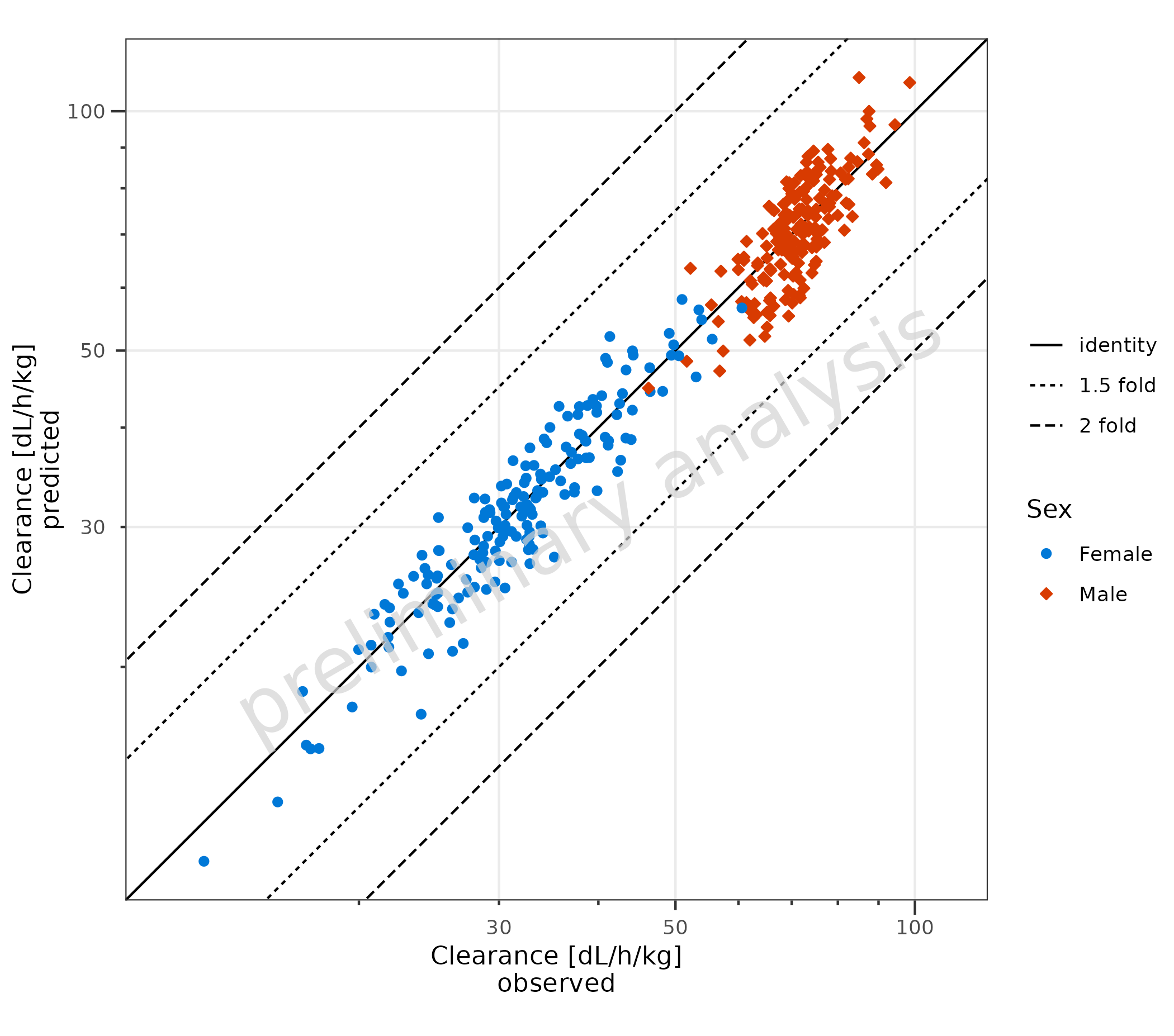
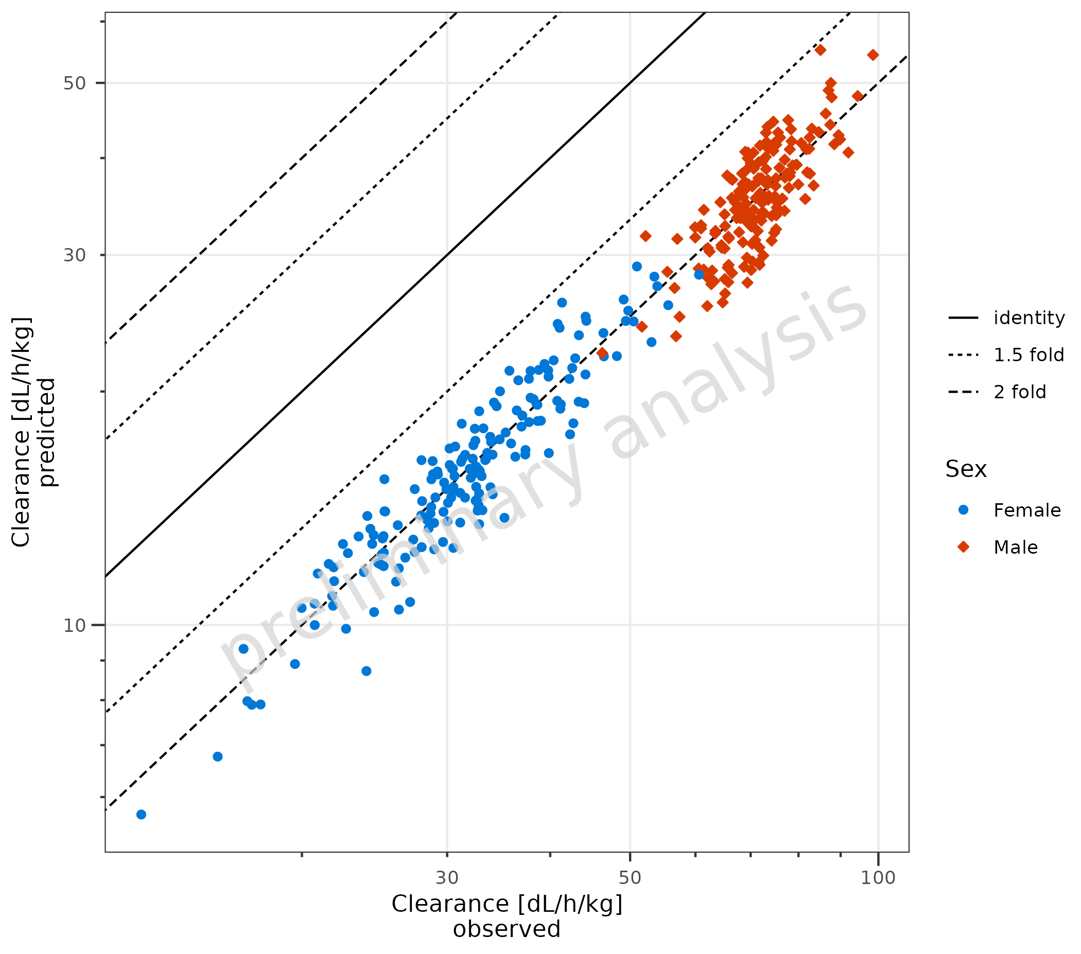
2. Predicted vs Observed (plotPredVsObs())
2.1 Basic Examples
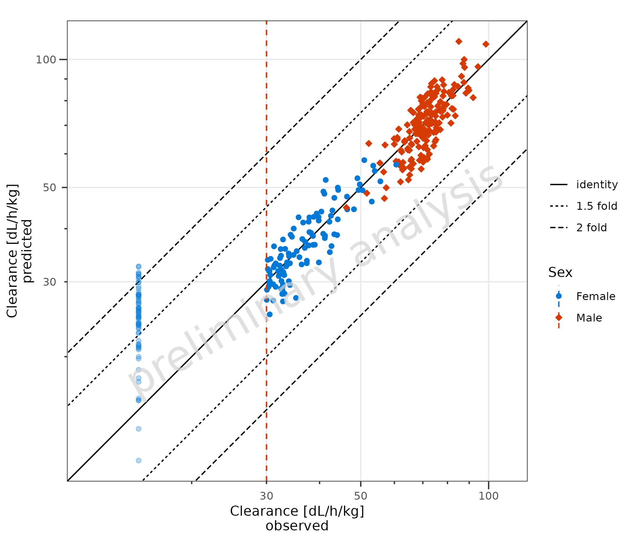
2.1.1 Default Settings
Basic example using default settings. Predicted and observed data are
mapped with predicted and observed. The
aesthetic groupby can be used to group observations.
plotPredVsObs(
  data = data,
  mapping = aes(
    observed = Obs,
    predicted = Pred,
    groupby = Sex
  ),
  metaData = metaData
)
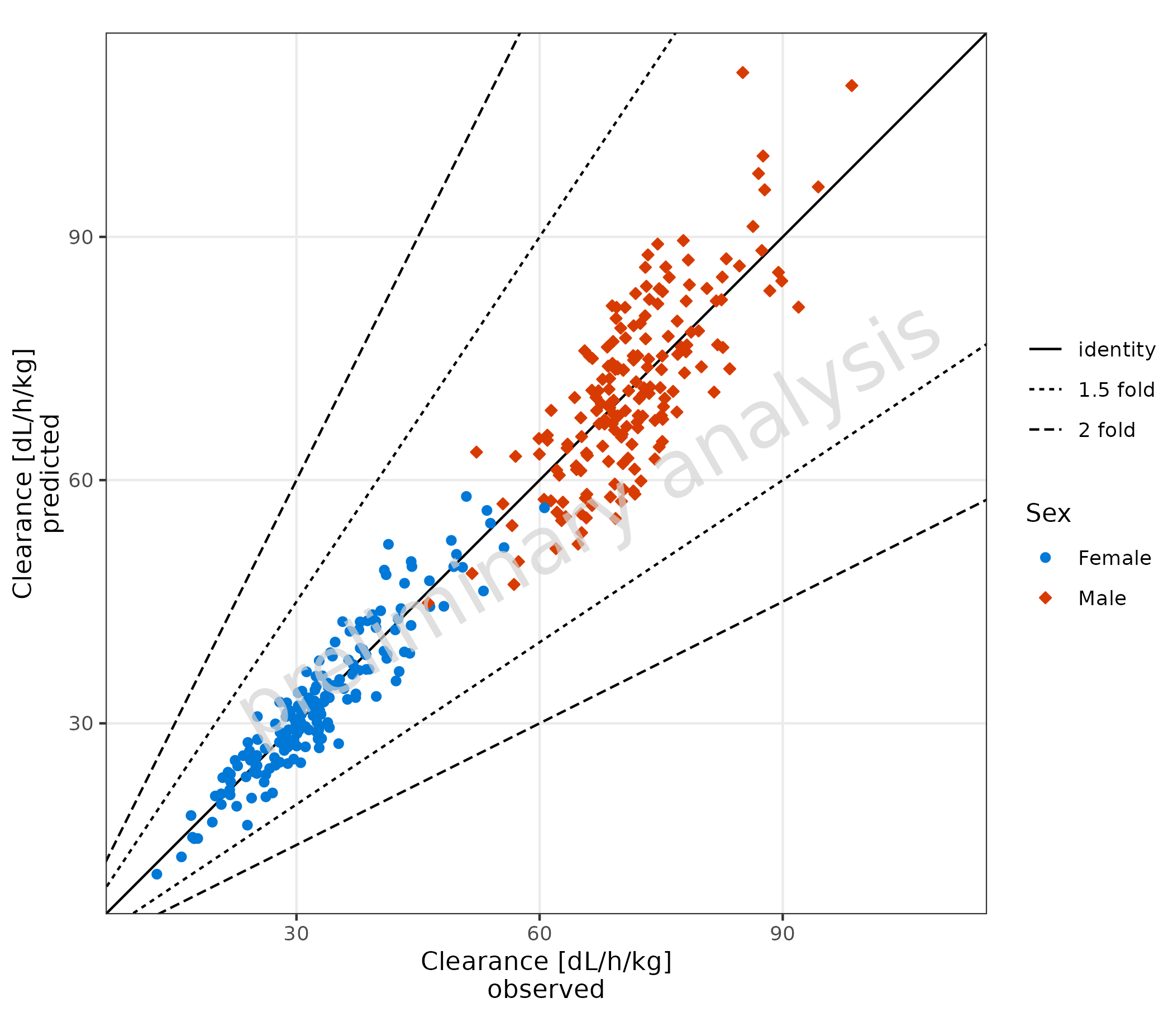
2.1.2 Basic Example: Linear Scale
The scale for the x and y axes is set to linear. It is not intended
to use different scales for the x and y axes. Therefore, only one
variable xyScale exists for both axes.
Predicted and observed data are mapped with x and
y.
plotPredVsObs(
  data = data,
  mapping = aes(
    x = Obs,
    y = Pred,
    groupby = Sex
  ),
  metaData = metaData,
  xyScale = "linear"
)
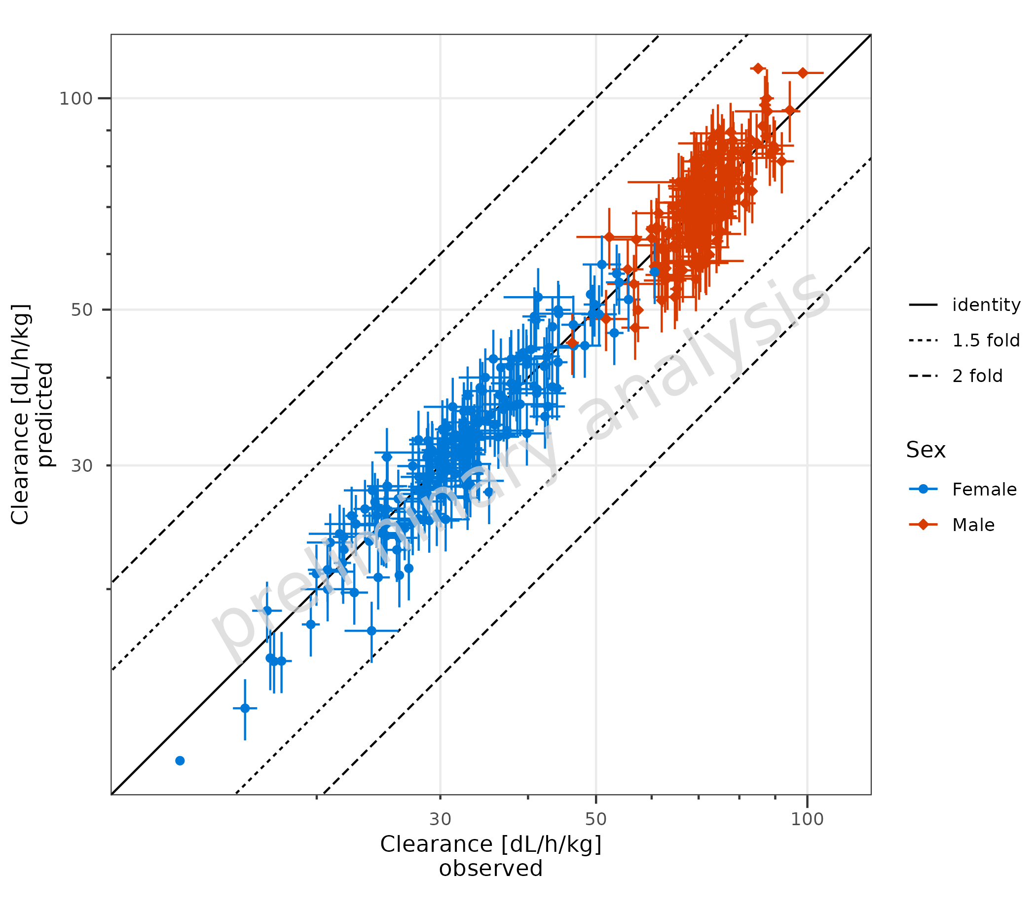
2.1.3 Error Bars for Observed Data
Error bars for the observed data are plotted. In the example, this is
done by mapping error_relative. Error bars could also be
produced by mapping error to a column with an additive
error or mapping xmin and xmax explicitly.
plotPredVsObs(
  data = data,
  mapping = aes(
    x = Obs,
    y = Pred,
    error_relative = gsd,
    groupby = Sex
  ),
  metaData = metaData
)
2.1.4 Error Bars for Observed and Predicted Data
To plot the prediction error, ymin and ymax
must also be mapped explicitly.
plotPredVsObs(
  data = data,
  mapping = aes(
    x = Obs,
    y = Pred,
    error_relative = gsd,
    ymin = Pred * 0.9,
    ymax = Pred * 1.1,
    groupby = Sex
  ),
  metaData = metaData
)
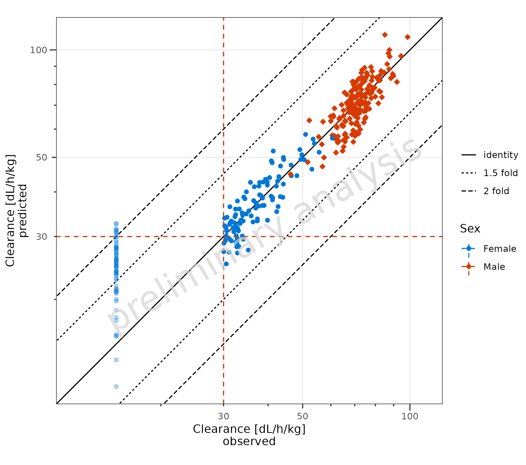
2.1.5 Example with LLOQ
Below, a dataset is created where the LLOQ is set to the 0.1 quantile
of the observed data. All values below are set to LLOQ/2. By mapping
lloq, these data are displayed with a lighter alpha, and a
horizontal line for the LLOQ is added.
lloqData <- signif(quantile(data$Obs, probs = 0.1), 1)

dataLLOQ <- data |>
  dplyr::mutate(lloq = lloqData) |>
  dplyr::mutate(Obs = ifelse(Obs <= lloq, lloq / 2, Obs))

plotPredVsObs(
  data = dataLLOQ,
  mapping = aes(
    x = Obs,
    y = Pred,
    lloq = lloq,
    groupby = Sex
  ),
  metaData = metaData
)
By default (lloqOnBothAxes = FALSE), the LLOQ line is
drawn only for the observed-data axis—i.e., horizontal when observations
are on the y-axis and vertical when observations are on the x-axis.
Setting lloqOnBothAxes = TRUE draws LLOQ lines on both the
x and y axes. This is quite useful, as it makes it clear if the
simulated results should be considered as “quantifiable” or not.
plotPredVsObs(
  data = dataLLOQ,
  mapping = aes(
    x = Obs,
    y = Pred,
    lloq = lloq,
    groupby = Sex
  ),
  metaData = metaData,
  lloqOnBothAxes = TRUE
)
2.2 Adjust Comparison Lines
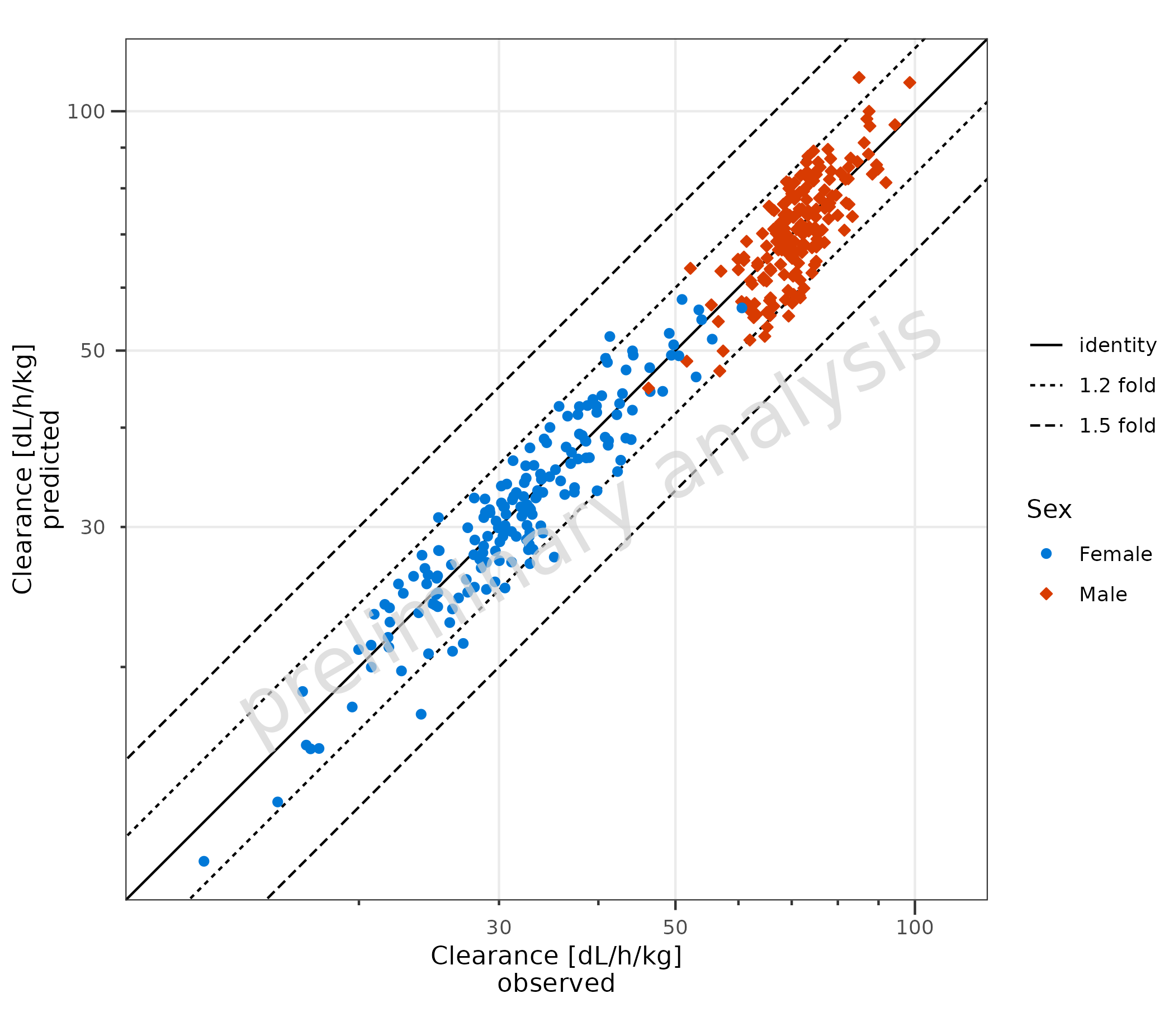
2.2.1 Adjust Fold Distance
plotPredVsObs() adds lines to indicate fold distances.
The lines are defined by the variable comparisonLineVector,
which is a named list with default values
list(identity = 1, '1.5 fold' = c(1.5, 1/1.5), '2 fold' = c(2, 1/2)).
A fold distance list can be generated by the helper function
?getFoldDistanceList().
Below, the 1.2 and 1.5 distances are displayed:
plotPredVsObs(
  data = data,
  mapping = aes(
    x = Obs,
    y = Pred,
    groupby = Sex
  ),
  metaData = metaData,
  comparisonLineVector = getFoldDistanceList(c(1.2, 1.5))
)
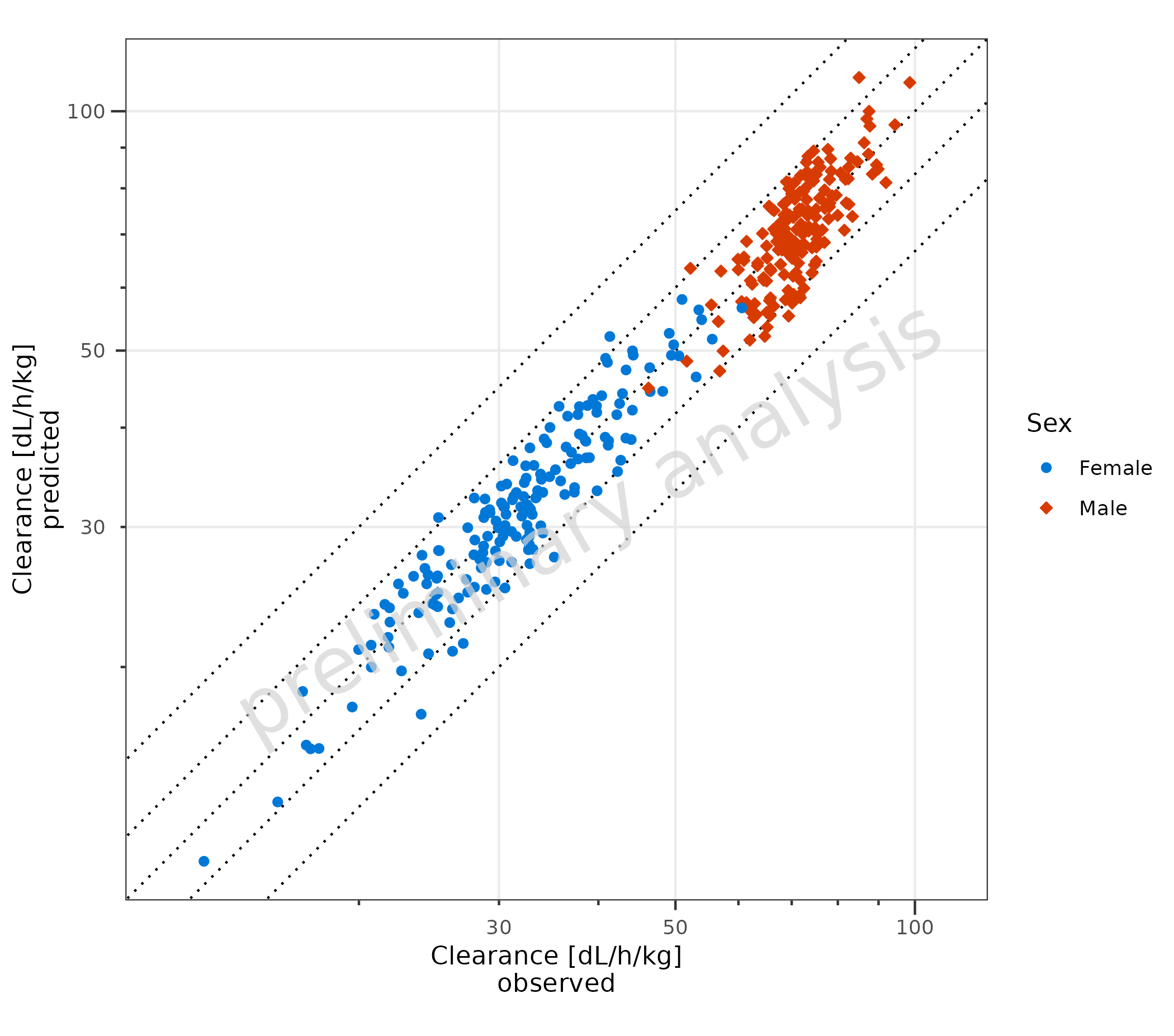
2.2.2 Adjust Display of Lines
The names of the list are displayed in the legend.
If the list is unnamed, all lines are displayed with the same line
type, and they are not included in the legend. The line type used is
settable by the variable geomComparisonLineAttributes.
If the variable comparisonLineVector is NULL, no lines
will be displayed.
plotPredVsObs(
  data = data,
  mapping = aes(
    x = Obs,
    y = Pred,
    groupby = Sex
  ),
  metaData = metaData,
  comparisonLineVector = unname(getFoldDistanceList(c(1.2, 1.5))),
  geomComparisonLineAttributes = list(linetype = "dotted")
)
2.3 Adding a Regression Line
To add a regression line, set the input variable
addRegression to TRUE (A). For regression
lines, the package ggpubr has a function
stat_regline_equation to add statistics of the regression
as labels (B). To use other functions, e.g., local polynomial
regression, use ggplot2::geom_smooth directly (C).
# A
plotObject <- plotPredVsObs(
  data = data,
  mapping = aes(
    x = Obs,
    y = Pred,
    groupby = Sex
  ),
  metaData = metaData,
  addRegression = TRUE
) +
  labs(title = "Regression Line", tag = "A")

plot(plotObject)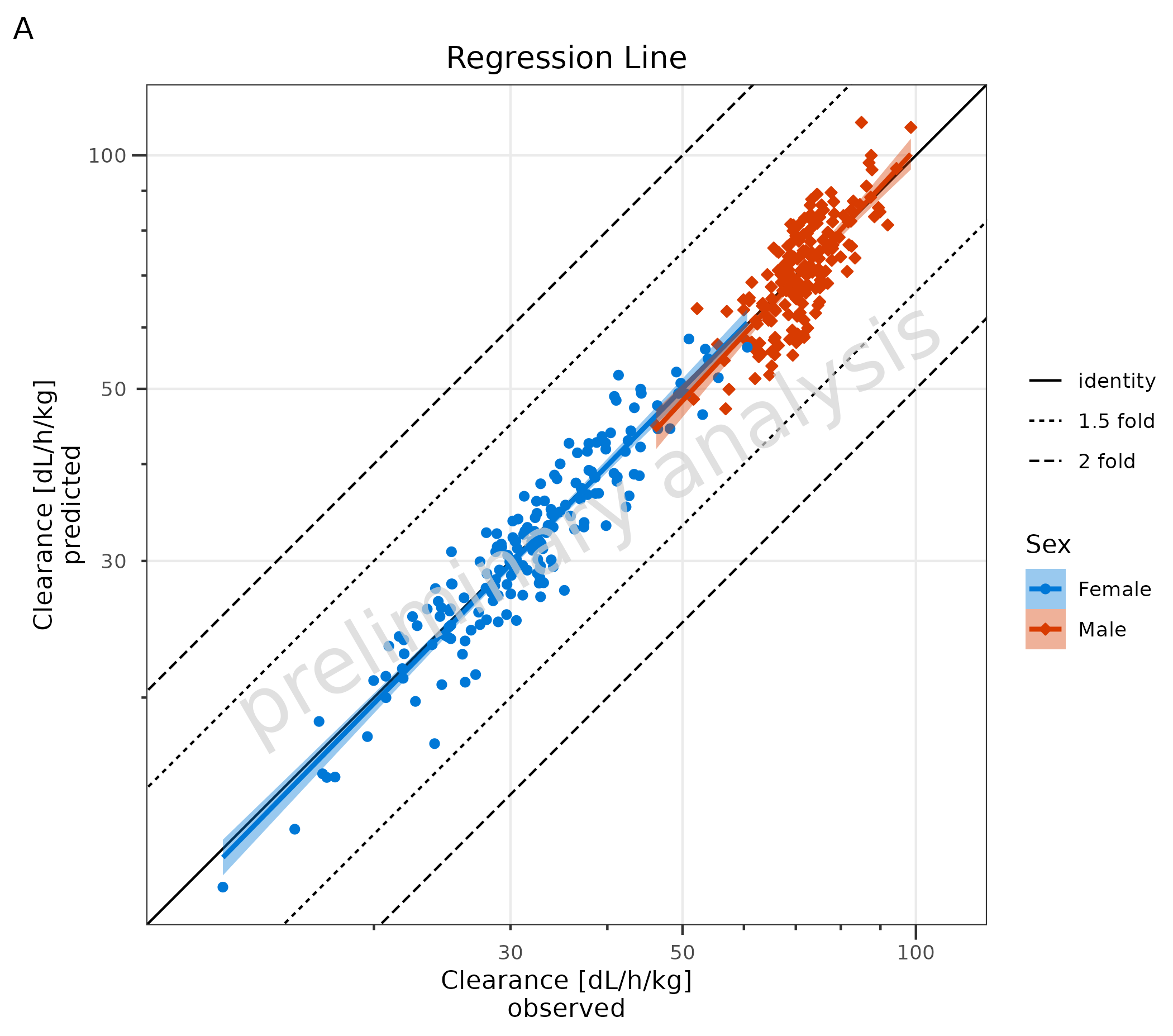
# B
plotObject + ggpubr::stat_regline_equation(aes(label = after_stat(rr.label))) + labs(title = "With RR as Label", tag = "B")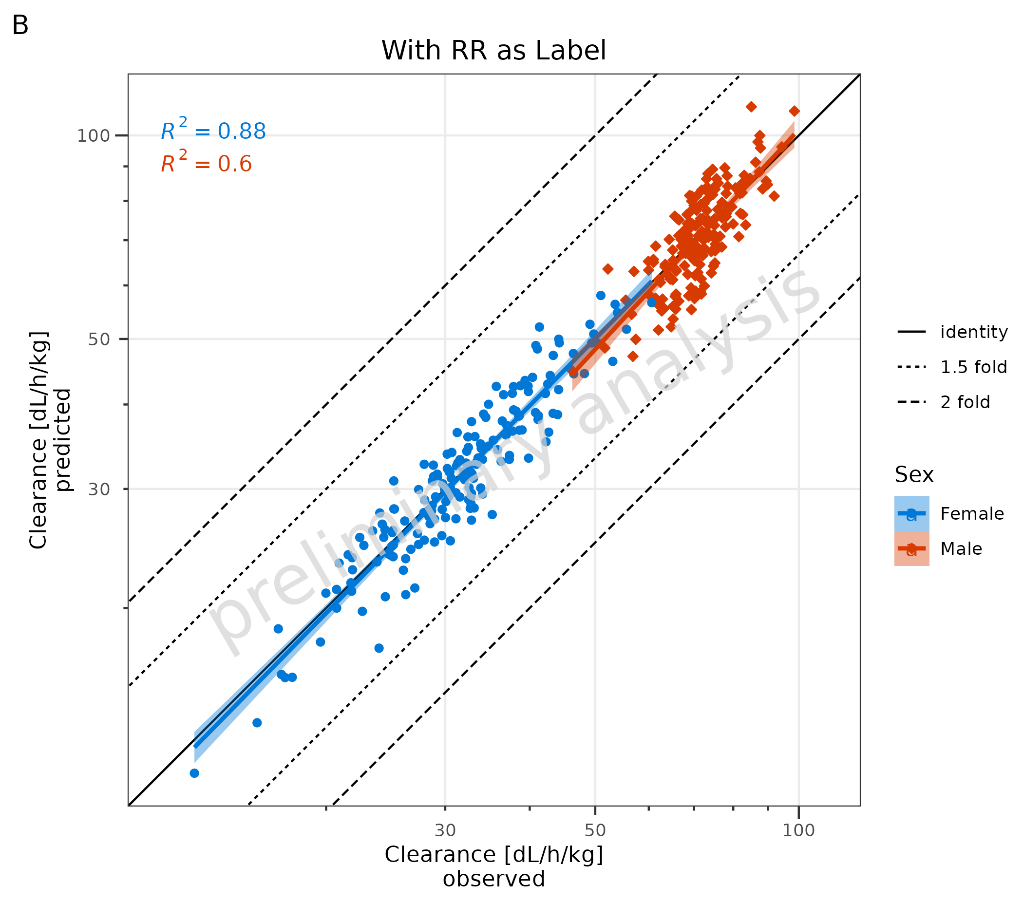
# C Local Polynomial Regression Fitting
plotPredVsObs(
  data = data,
  mapping = aes(
    x = Obs,
    y = Pred,
    groupby = Sex
  ),
  metaData = metaData,
  addRegression = FALSE
) +
  geom_smooth(method = "loess", formula = "y ~ x", na.rm = TRUE) +
  labs(title = "Local Polynomial Regression Fitting", tag = "C")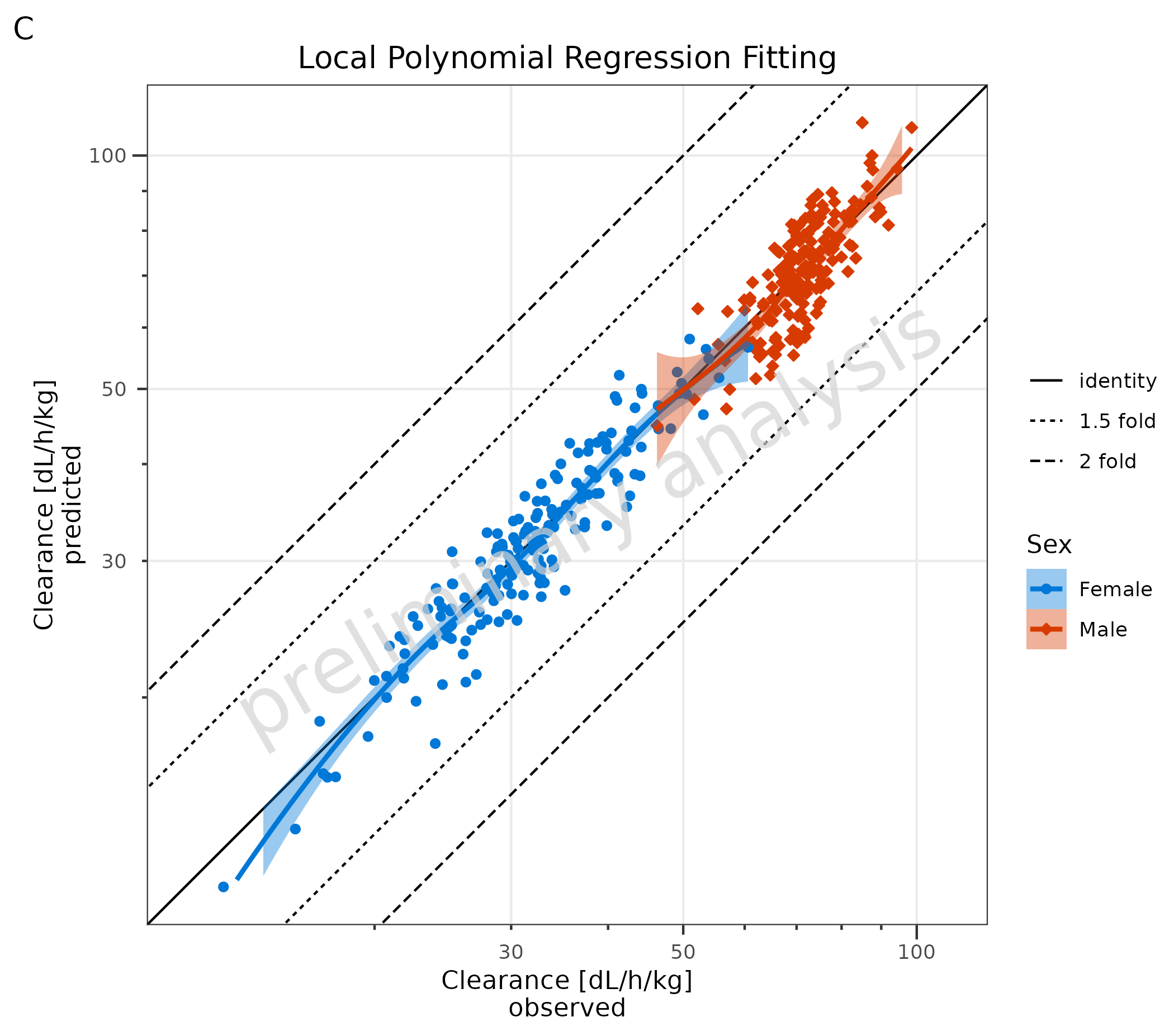
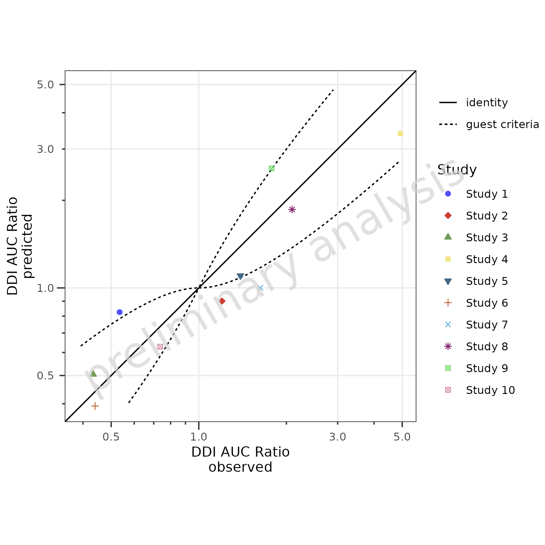
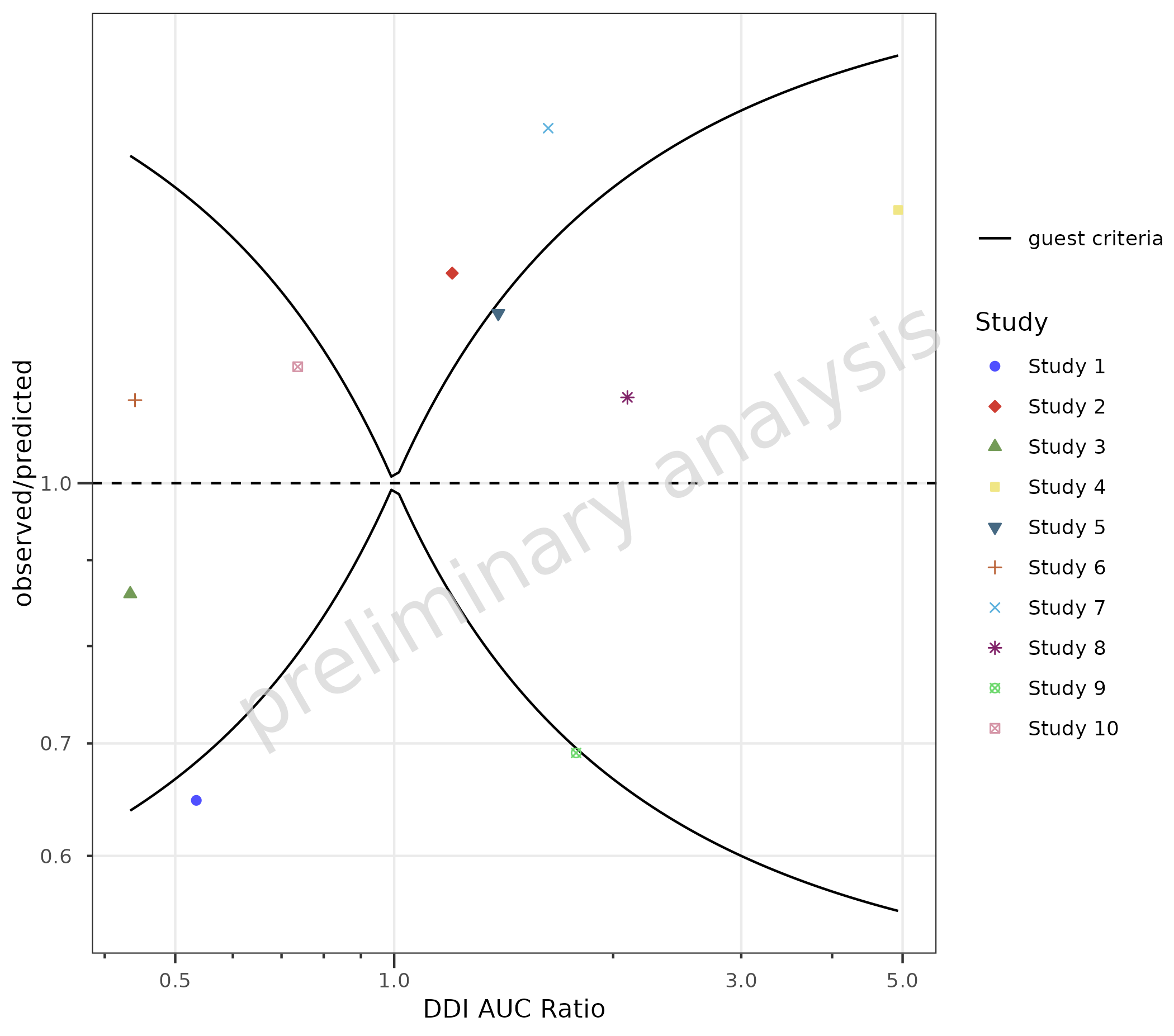
2.4 Add Guest Criteria Lines
To compare DDI ratios, set the variable addGuestLimits
to TRUE and set the variable deltaGuest:
plotPredVsObs(
  data = dDIdata,
  mapping = aes(
    x = Obs,
    y = Pred,
    groupby = Study
  ),
  metaData = dDImetaData,
  addGuestLimits = TRUE,
  comparisonLineVector = list(identity = 1),
  deltaGuest = 1
)
2.5 Use Non-Square Format
By default, plotPredVsObs() produces a square plot with
an aspect ratio of 1 and the same limits for the x and y axes. In the
example below, the Predicted values are set to 1/2 of the original
values. A square plot does not make sense anymore; therefore, the
variable asSquarePlot is set to FALSE.
dataNonSquare <- data |>
  dplyr::mutate(Pred = Pred / 2)

plotPredVsObs(
  data = dataNonSquare,
  mapping = aes(
    x = Obs,
    y = Pred,
    groupby = Sex
  ),
  metaData = metaData,
  asSquarePlot = FALSE
)
3. Residuals vs Covariate (plotResVsCov())
3.1 Basic Examples
Residuals must be pre-calculated before passing them to
plotResVsCov(). If you are using the
{ospsuite} package, you can use
ospsuite::addResidualColumn() to add a residual column to
your data. Alternatively, calculate residuals directly in your data
frame.
3.1.1 Default Settings
In the example below, log residuals are calculated as
log(Pred) - log(Obs) and mapped to the y
aesthetic. A horizontal comparison line with the value 0 is displayed.
The aesthetic groupby can be used to group
observations.
data <- data |>
  dplyr::mutate(logResiduals = log(Pred) - log(Obs))

plotResVsCov(
  data = data,
  mapping = aes(
    x = Age,
    y = logResiduals,
    groupby = Sex
  )
) +
  labs(y = "residuals\nlog(predicted) - log(observed)")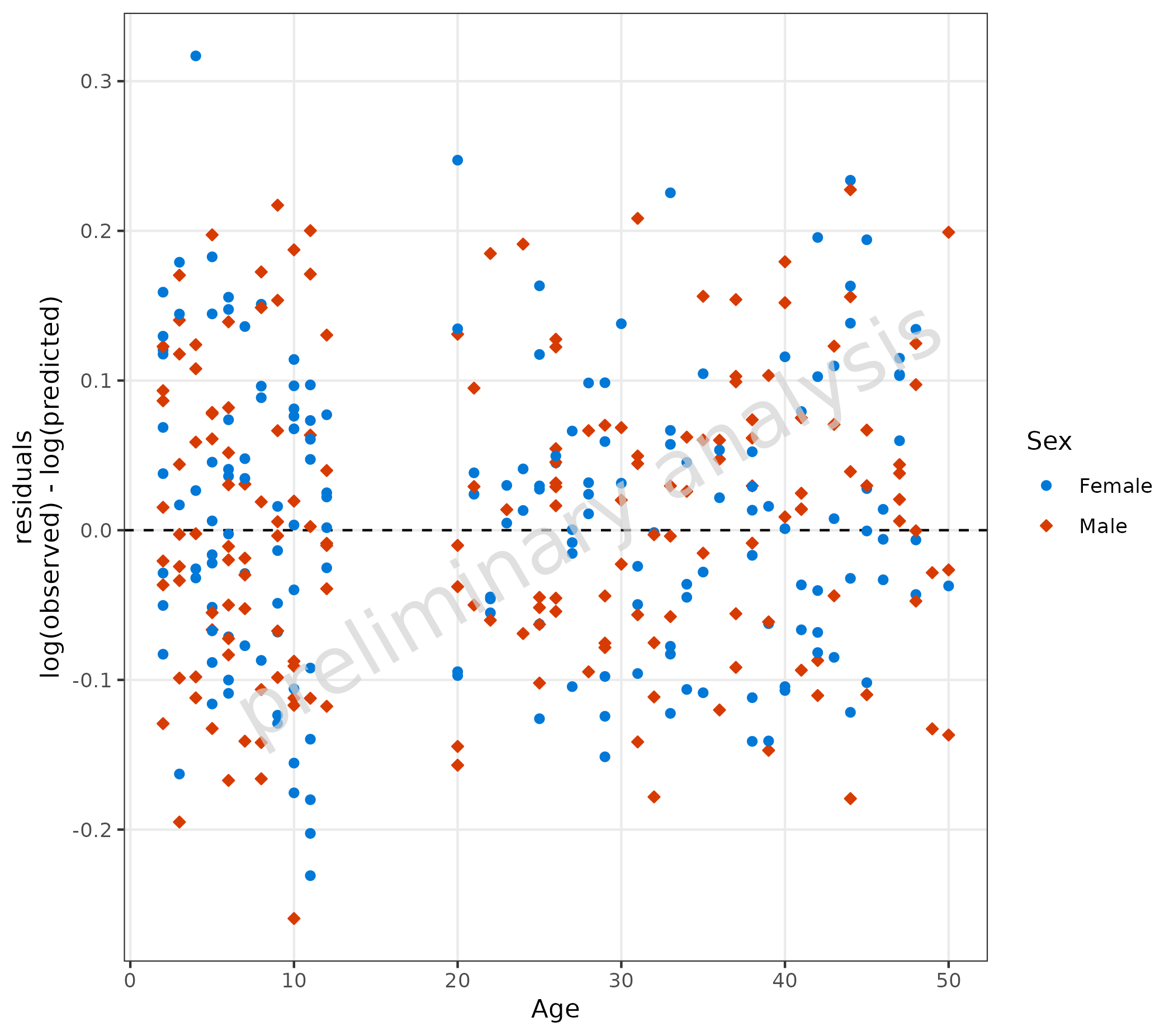
3.1.2 Linear Scale for Residuals
For linear residuals, calculate Pred - Obs before
plotting.
Below, the line type of the comparison line is set to ‘solid’.
data <- data |>
  dplyr::mutate(linearResiduals = Pred - Obs)

plotResVsCov(
  data = data,
  mapping = aes(
    x = Age,
    y = linearResiduals,
    groupby = Sex
  ),
  geomComparisonLineAttributes = list(linetype = "solid")
) +
  labs(y = "residuals\npredicted - observed")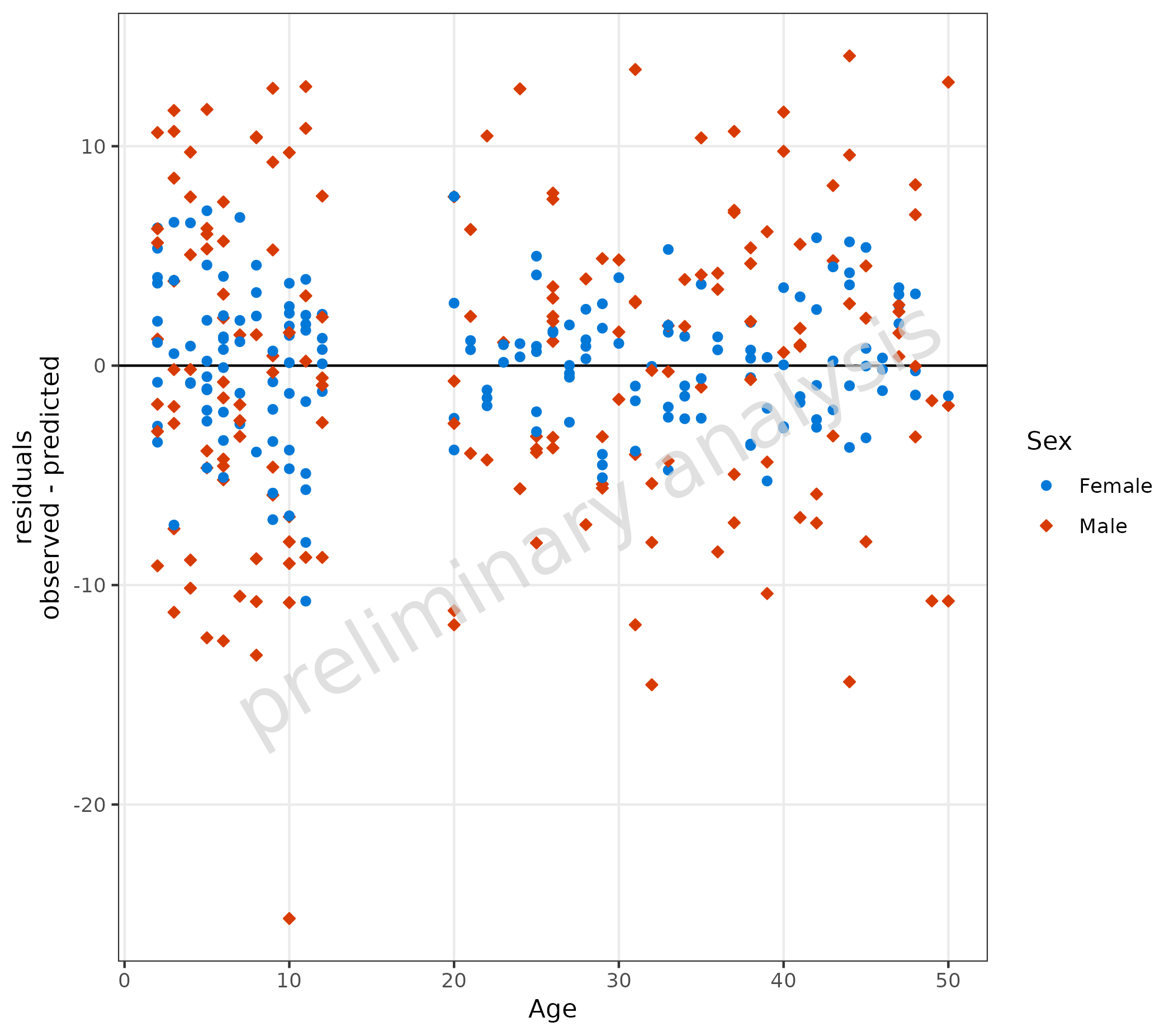
3.2 Adjusting Comparison Lines
plotResVsCov(
  data = data,
  mapping = aes(
    x = Age,
    y = logResiduals,
    groupby = Sex
  ),
  comparisonLineVector = list(zero = 0, "lower limit" = -0.25, "upper limit" = 0.25)
) +
  labs(y = "residuals\nlog(predicted) - log(observed)")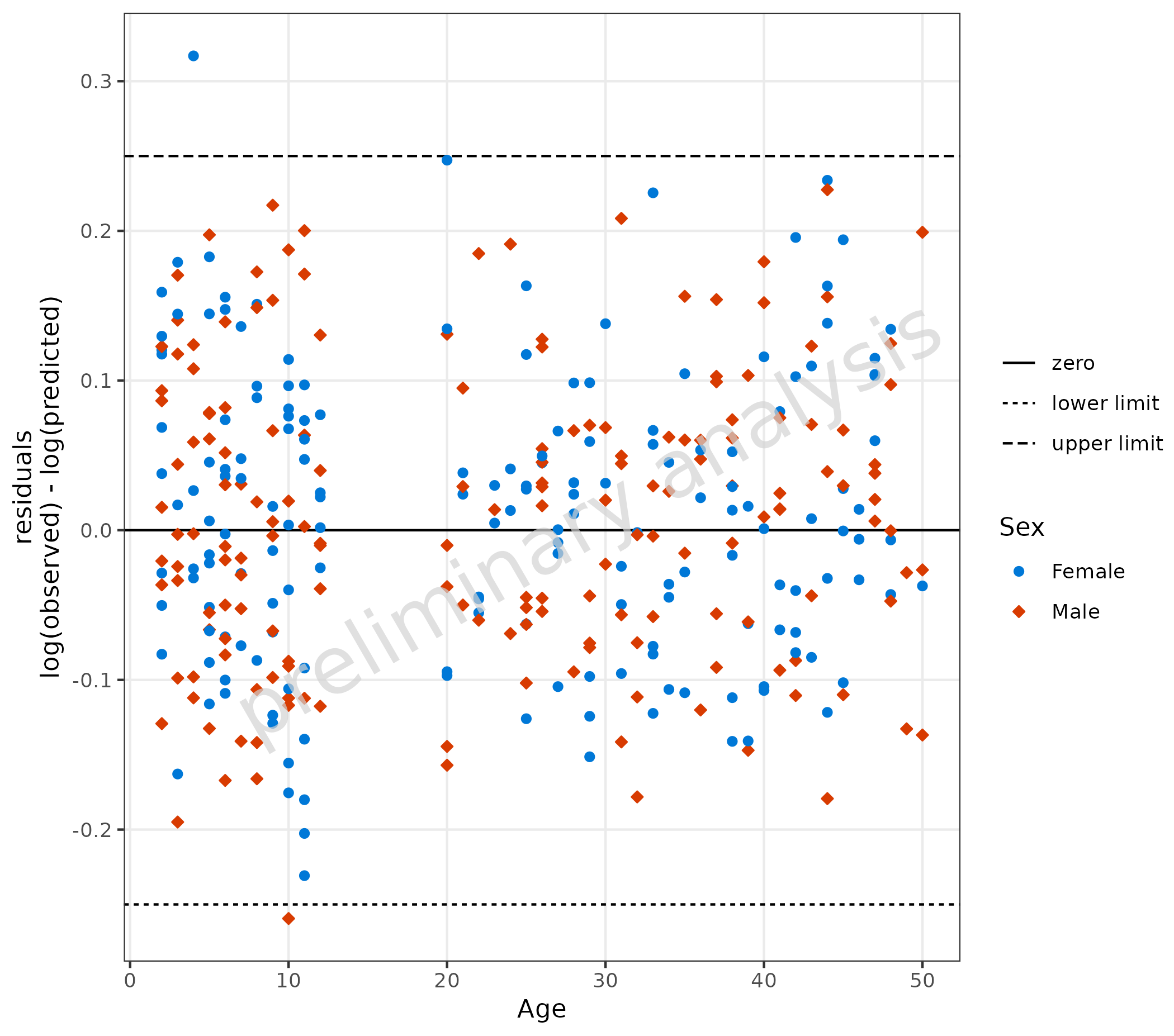
3.3 Adding a Regression Line
To add a regression line, set the input variable
addRegression to TRUE. For regression lines,
the package ggpubr has a nice function
stat_regline_equation to add statistics of the regression
as labels.
plotResVsCov(
  data = data,
  mapping = aes(
    x = Age,
    y = logResiduals,
    groupby = Sex
  ),
  addRegression = TRUE
) +
  labs(y = "residuals\nlog(predicted) - log(observed)") +
  ggpubr::stat_regline_equation(aes(label = after_stat(eq.label)))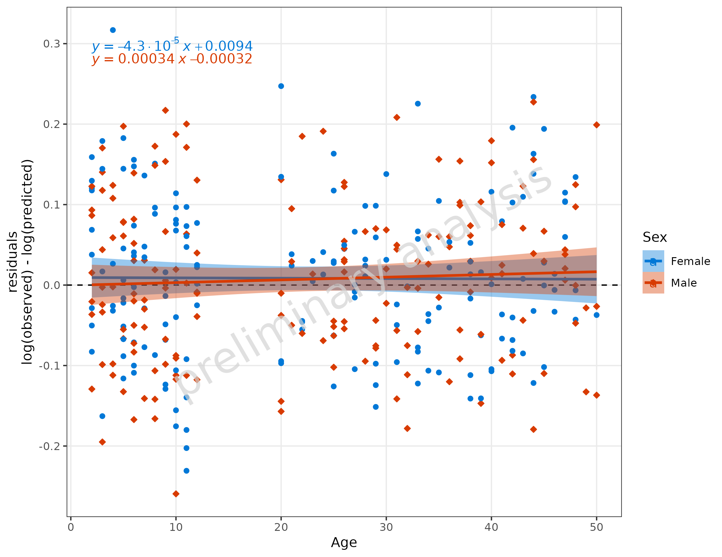
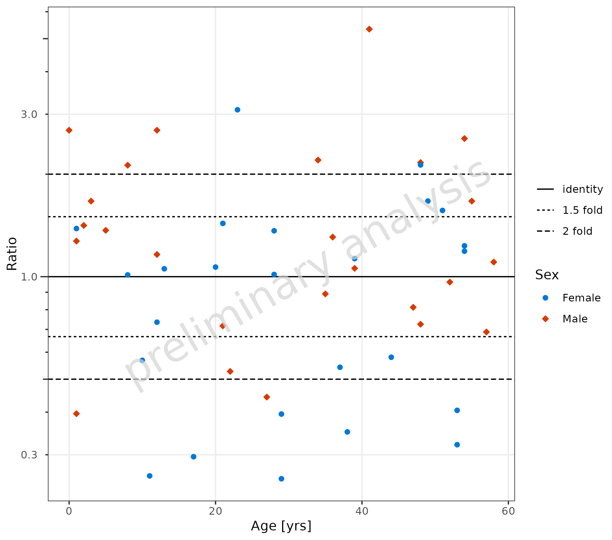
4. Ratio Plots (plotRatioVsCov())
4.1 Basic Examples
4.1.1 Default Settings
plotRatioVsCov() is used to evaluate ratios versus a
covariate. By default, the identity and 1.5 and 2 point lines are added,
and the default for yScale is ‘log’. The aesthetic
groupby can be used to group observations.
plotRatioVsCov(
  data = pkRatioData,
  mapping = aes(
    x = Age,
    y = Ratio,
    groupby = Sex
  ),
  metaData = metaData
)
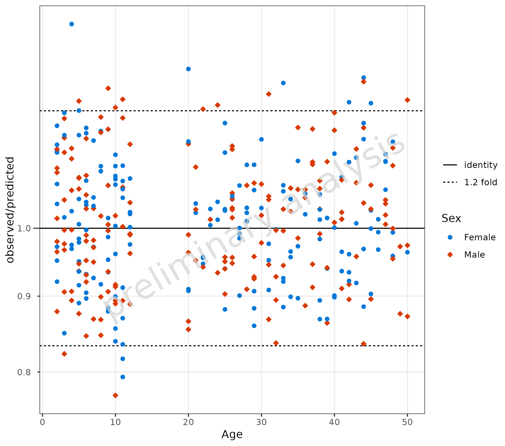
4.1.2 Compare Residuals as Ratio
The ratio of observed to predicted is calculated as
.
Pre-calculate this column before passing to
plotRatioVsCov(). Below, the comparison line is set to a
1.2 fold distance.
data <- data |>
  dplyr::mutate(Ratio = Obs / Pred)

plotRatioVsCov(
  data = data,
  mapping = aes(
    x = Age,
    y = Ratio,
    groupby = Sex
  ),
  comparisonLineVector = getFoldDistanceList(c(1.2))
)
4.1.3 Using {ospsuite.plots} Specific Aesthetics like
MDV and error_relative
If some of the data should be omitted, we can do this by mapping a
logical column to the aesthetic mdv. Below, we exclude data
with Age less than 20.
Additional error bars are displayed by mapping the column “gsd” to
the aesthetic error_relative.
plotRatioVsCov(
  data = pkRatioData,
  mapping = aes(
    x = Age,
    y = Ratio,
    error_relative = gsd,
    mdv = Age < 20,
    groupby = Sex
  )
) + theme(legend.box = "horizontal", legend.title = element_blank())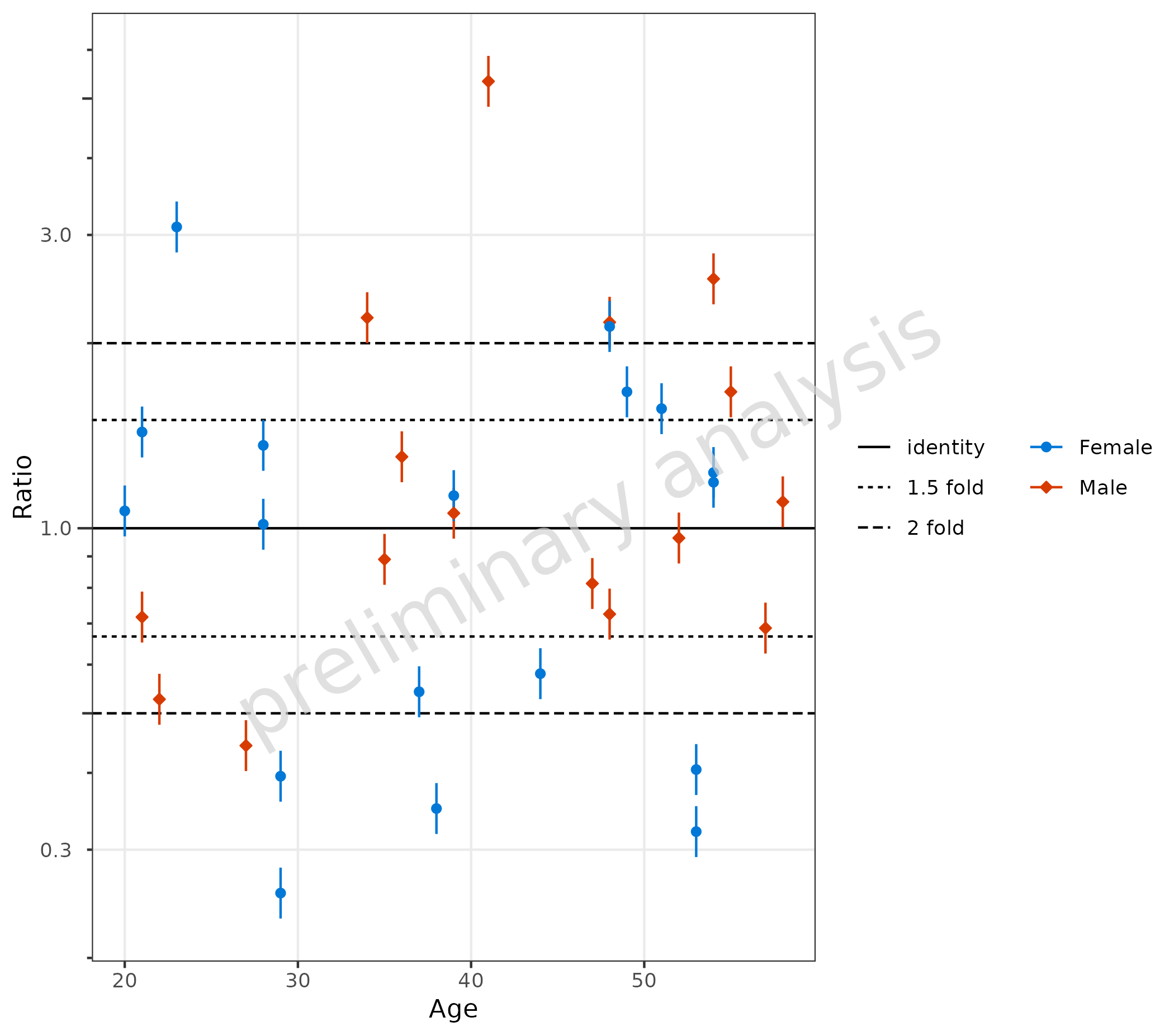
4.2 Qualification of Ratios
If the data.table package is installed and the
variable comparisonLineVector is a named list, the
{ggplot} object returned by plotRatioVsCov has
an additional entry countsWithin, which contains a
data.frame with the fractions within the specific ranges
given by the variable comparisonLineVector.
plotObject <- plotRatioVsCov(
  data = pkRatioData,
  mapping = aes(
    x = Age,
    y = Ratio,
    groupby = Sex
  ),
  metaData = metaData
)

plot(plotObject)

knitr::kable(plotObject$countsWithin, caption = "Counts and fraction within ranges")| group | Points total | 1.5 fold Number | 1.5 fold Fraction | 2 fold Number | 2 fold Fraction |
|---|---|---|---|---|---|
| all Groups | 50 | 24 | 0.48 | 32 | 0.64 |
| Female | 25 | 11 | 0.44 | 16 | 0.64 |
| Male | 25 | 13 | 0.52 | 16 | 0.64 |

4.3 Add Guest Criteria Lines
To compare DDI ratios, set the variable addGuestLimits
to TRUE and set the variable deltaGuest.
dDIdata <- dDIdata |>
  dplyr::mutate(Ratio = Obs / Pred)

plotObject <- plotRatioVsCov(
  data = dDIdata,
  mapping = aes(
    x = Obs,
    y = Ratio,
    groupby = Study
  ),
  metaData = dDImetaData,
  addGuestLimits = TRUE,
  comparisonLineVector = 1
)

print(plotObject)
knitr::kable(plotObject$countsWithin)| group | Points total | guest criteria Number | guest criteria Fraction |
|---|---|---|---|
| all Groups | 10 | 6 | 0.6 |
| Study 1 | 1 | 0 | 0.0 |
| Study 2 | 1 | 0 | 0.0 |
| Study 3 | 1 | 1 | 1.0 |
| Study 4 | 1 | 1 | 1.0 |
| Study 5 | 1 | 1 | 1.0 |
| Study 6 | 1 | 1 | 1.0 |
| Study 7 | 1 | 0 | 0.0 |
| Study 8 | 1 | 1 | 1.0 |
| Study 9 | 1 | 0 | 0.0 |
| Study 10 | 1 | 1 | 1.0 |
5. Quantile Plot (plotQQ())
plotQQ() produces a Quantile-Quantile plot. Residuals
must be pre-calculated and mapped to the sample
aesthetic.
Note: If you are using the
{ospsuite}package, you can useospsuite::addResidualColumn()to add a residual column to your data.
data <- data |>
  dplyr::mutate(logResiduals = log(Pred) - log(Obs))

plotQQ(
  data = data,
  mapping = aes(
    sample = logResiduals,
    groupby = Sex
  )
) +
  labs(y = "residuals\nlog(predicted) - log(observed)")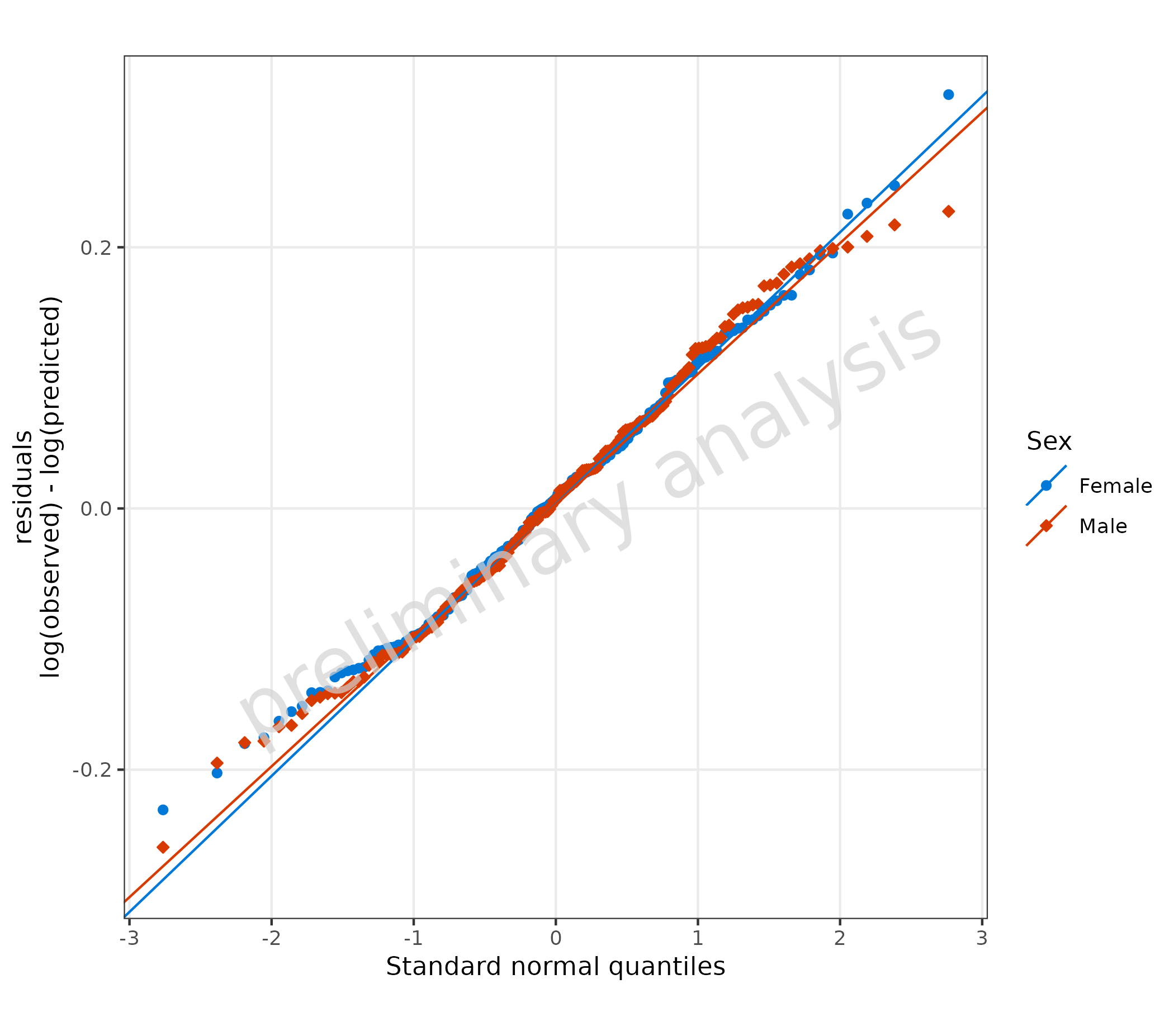
6 Residuals in Other Plot Functions
Pre-calculated residuals can be used in plotHistogram()
and plotBoxWhisker() by mapping the residual column to the
appropriate aesthetic.
6.1 Residuals as Histogram
plotHistogram(
  data = data,
  metaData = metaData,
  mapping = aes(
    x = logResiduals,
    groupby = Sex
  ),
  plotAsFrequency = TRUE,
  distribution = "normal"
) + geom_vline(xintercept = 0, linetype = "dashed") +
  labs(x = "residuals\nlog(predicted) - log(observed)")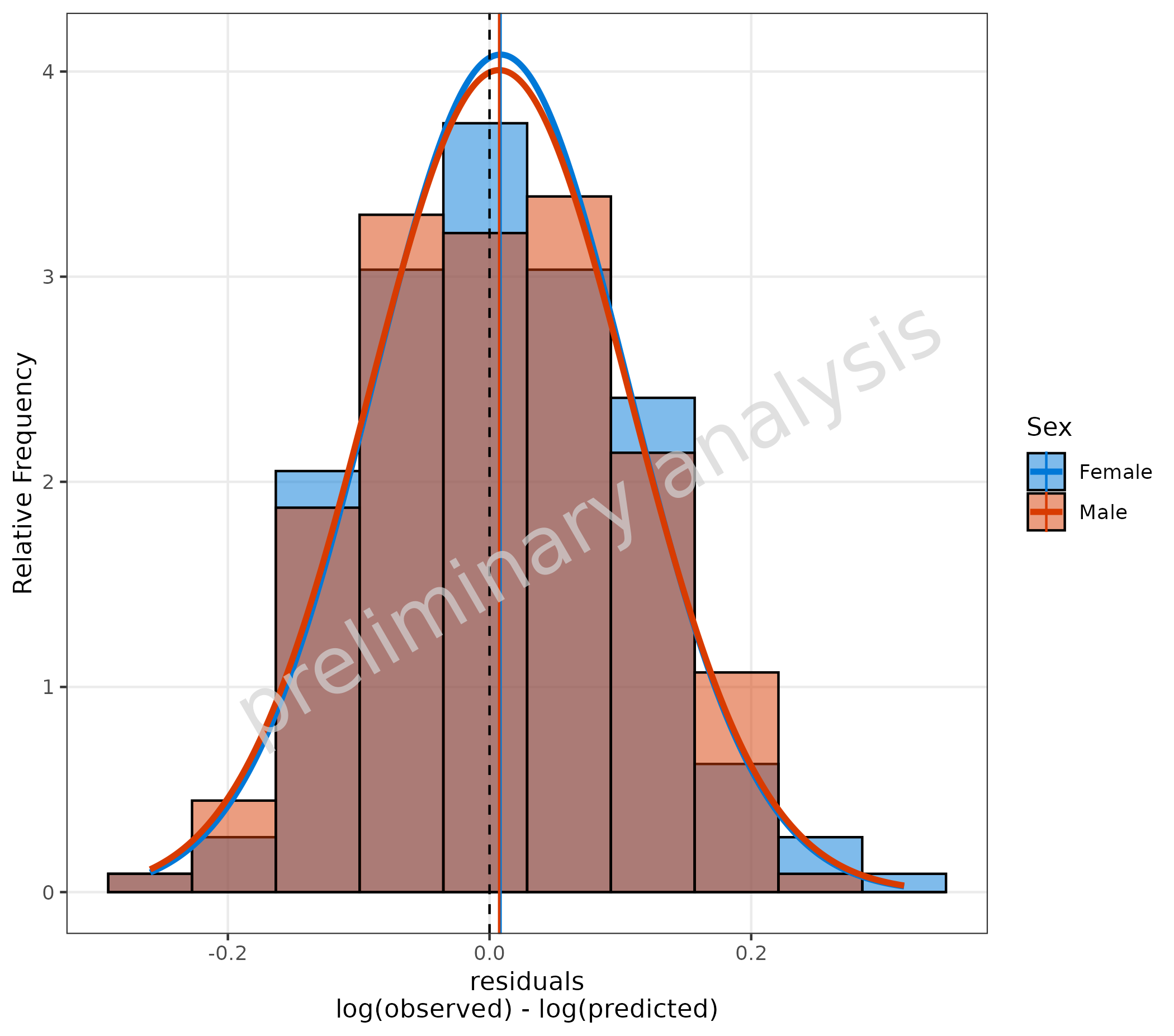
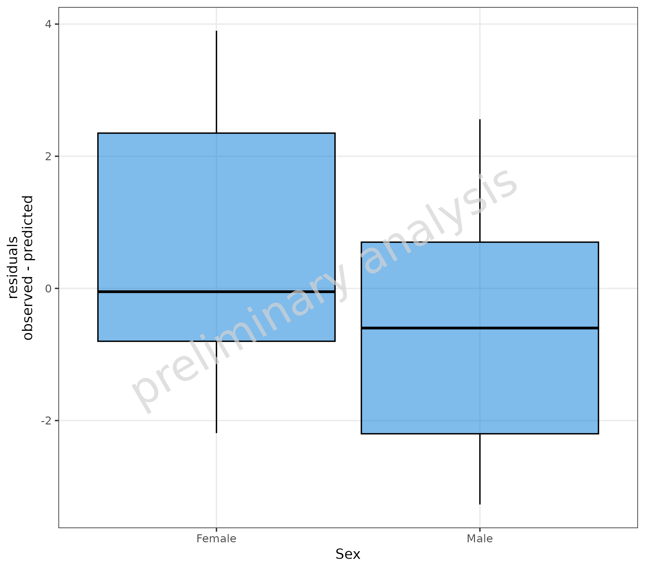
6.2 Stratify Residuals with a Box-Whisker Plot
pkRatioData <- pkRatioData |>
  dplyr::mutate(linearResiduals = Pred - Obs)

plotBoxWhisker(
  mapping = aes(
    y = linearResiduals,
    x = Sex
  ),
  data = pkRatioData,
  metaData = metaData
) +
  labs(y = "residuals\nlog(predicted) - log(observed)")